tabby
Timeline: 8 Weeks
Role: User Researcher, UX/UI Designer
Tools: Sketch, InVision, Marvel POP, Adobe Photoshop & Illustrator
Platform: iOS
Role: User Researcher, UX/UI Designer
Tools: Sketch, InVision, Marvel POP, Adobe Photoshop & Illustrator
Platform: iOS
tabby is a crowd-sourced cat-sitting service intended to improve the accessibility, availability, and affordability of pet-sitting exclusively for cat-owners. The application offers direct messaging, cashless payments and on-demand appointments to ensure a stress-free process from beginning to end.
If you live in Canada you likely own a pet, or know someone who does. Along with owning a pet comes the challenge of finding someone to care for your furry friend if you need to go away for a few days. However, pet sitting applications are highly targeted towards dog owners, leaving cat owners lost when seeking care for their pet.
38
of households in Canada have at least one cat.
10
increase in the cat population over the past decade.
67
of pet owners belong to younger generations.
How might we make cat-sitting services more accessible in order to accommodate the lives of cat-owners?
Process Overview
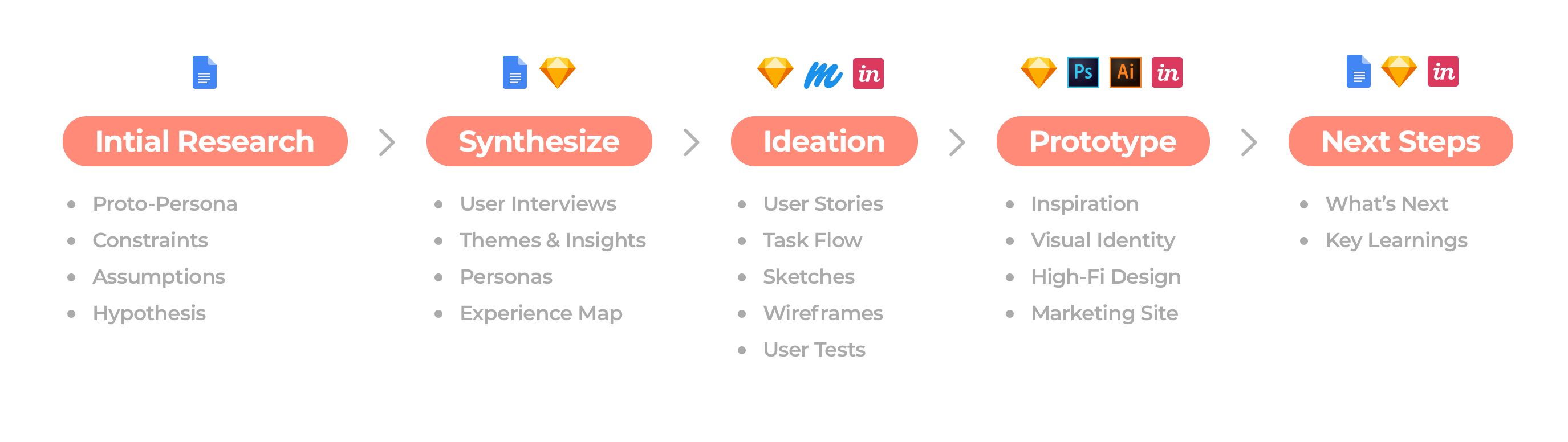
Initial Research
Let’s Dive In
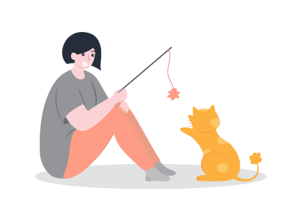
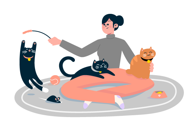
Owning a cat is a big responsibility. From feeding and refilling the water, to grooming and cleaning the litter box, taking care of cats can be a lot of work. So what are cat owners supposed to do when they have to go away for a few days?
Cat hotels are often the go-to option, but they are pricey and often a scary experience for the cat. Another popular option is to have friends or family check on your pet while you’re away, but this can be difficult to arrange and inconvenient for both parties. Why isn’t there a more accessible, and affordable option that cat owners can depend on?
”There are so many options when it comes to dog-sitting, why not cats?
Ultimate Impact
I would like to increase the availability, accessibility, and simplicity of finding a cat-sitter. I believe that trustworthiness and affordability are also key factors in the success of the app. Ultimately, I hope to alleviate stress amongst cat owners during the process of finding someone to care for their pet, as well as while they are away from their pet. Many people consider cats a member of the family and my goal is to treat them that way.
Constraints, Assumptions & Proto-Persona
Business
- Lack of supply of pet sitters
- Lack of demand for services
- Competitive space
- Cat-owners rely on friends and family
Technological
- App requires the user’s location
- Compensation requires user’s payment details
Cultural
- User’s could find in-home sitting services to be an invasion of privacy
- Current COVID-19 restrictions would drastically limit service options
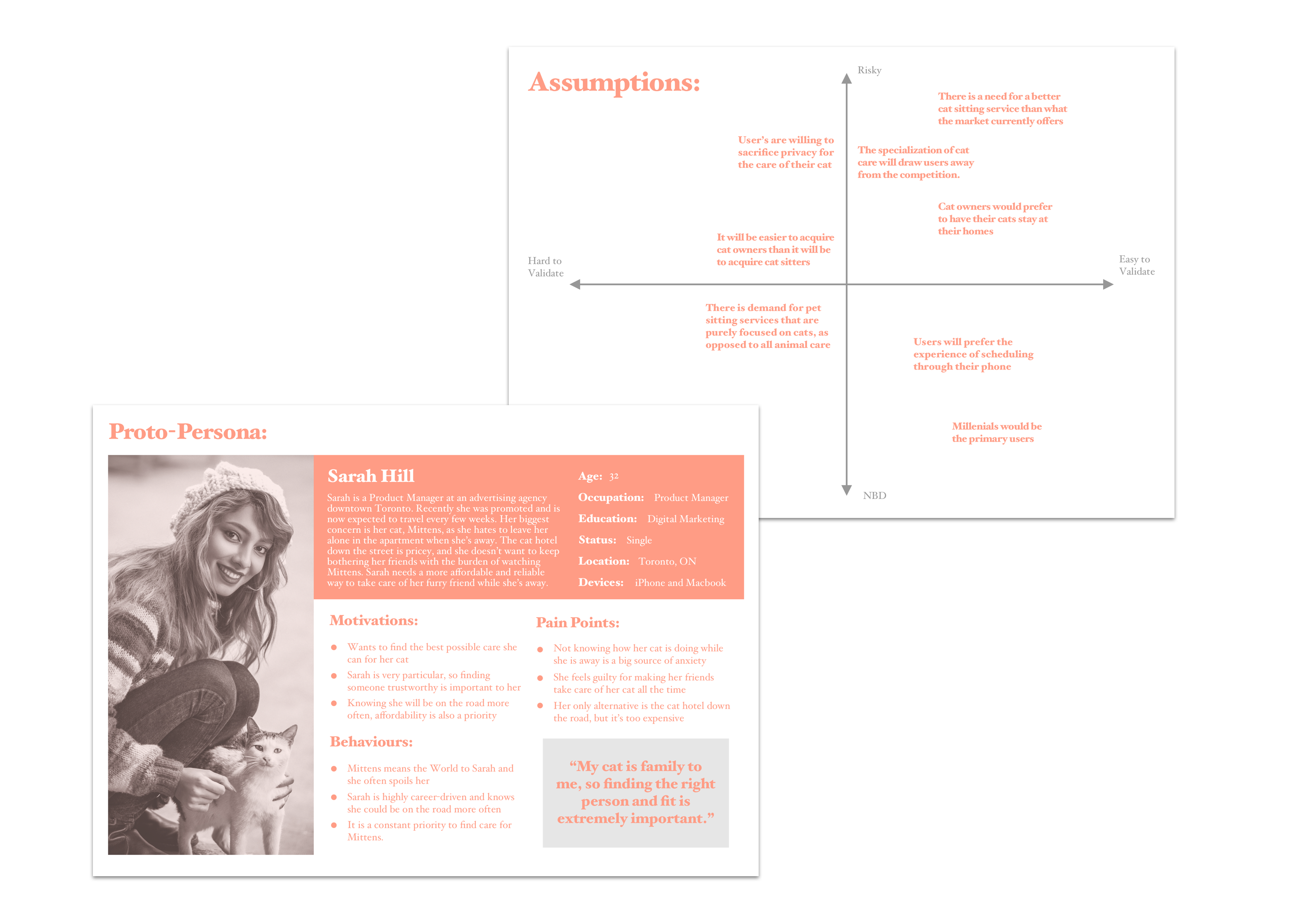
Hypothesis
I believe that designing a pet sitting app specifically for cat owners will increase the availability, accessibility, and simplicity of finding cat sitting services. I’ll know this to be true when I see an increase in the overall frequency of cat sitting appointments.
Synthesize
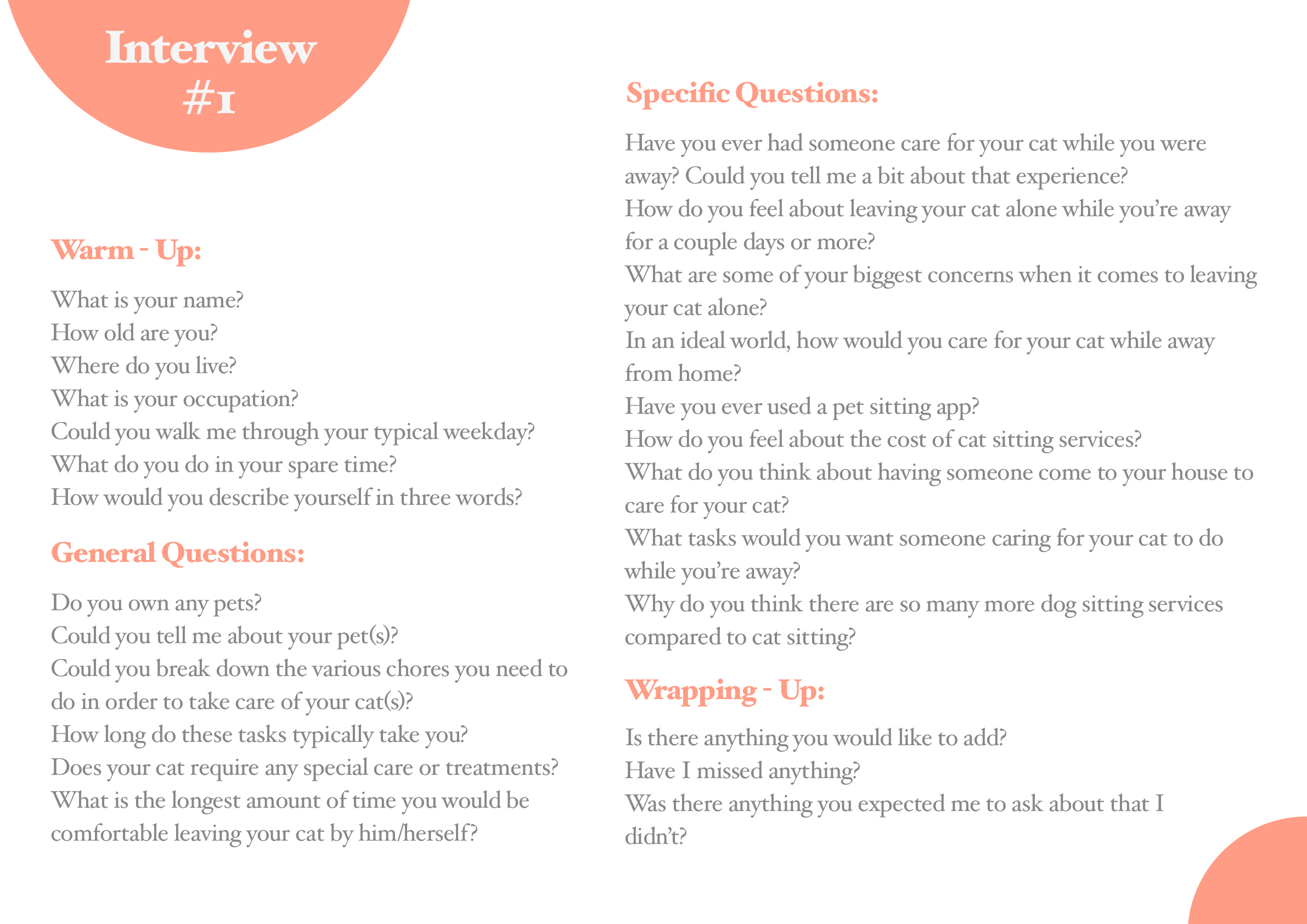
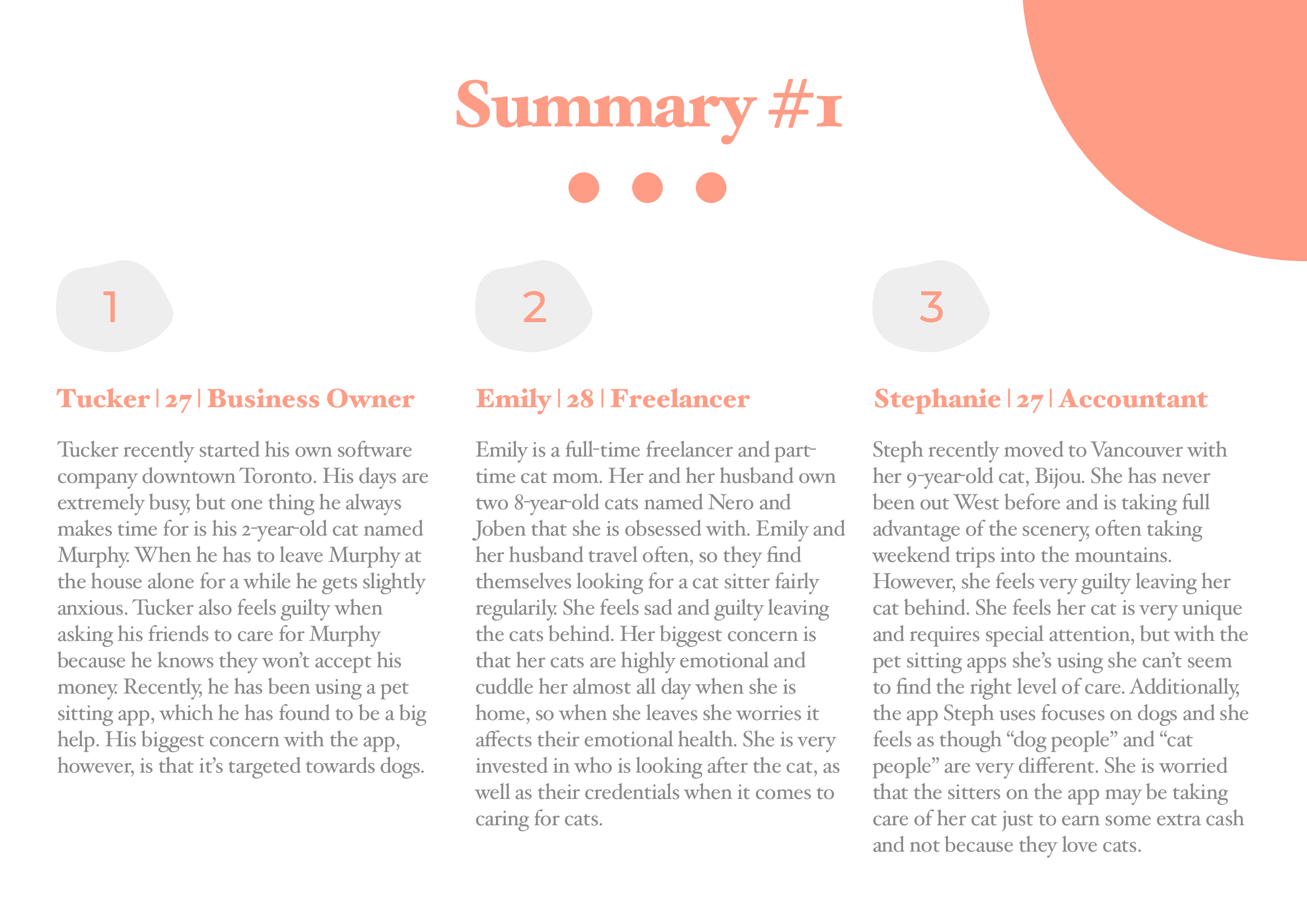
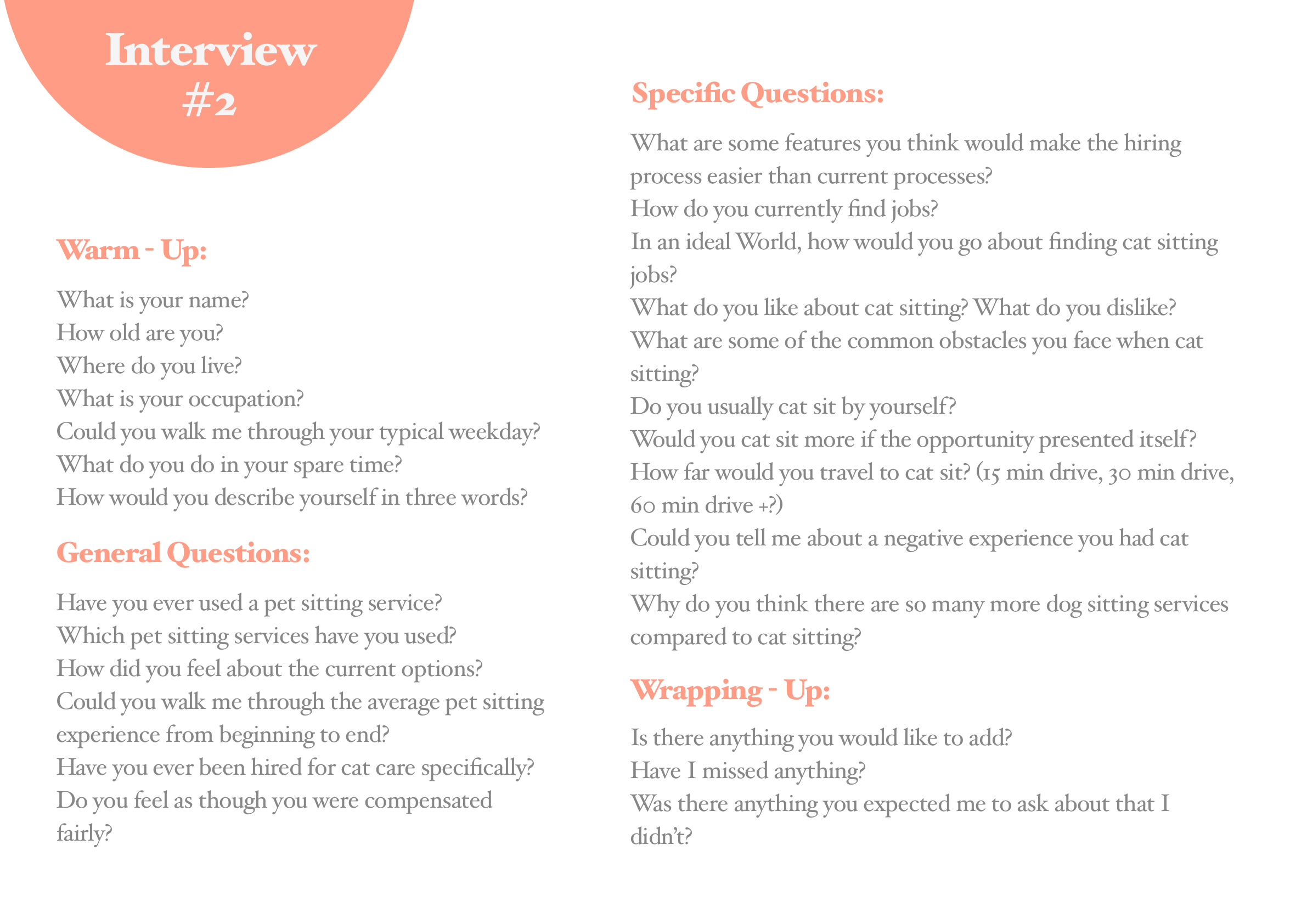
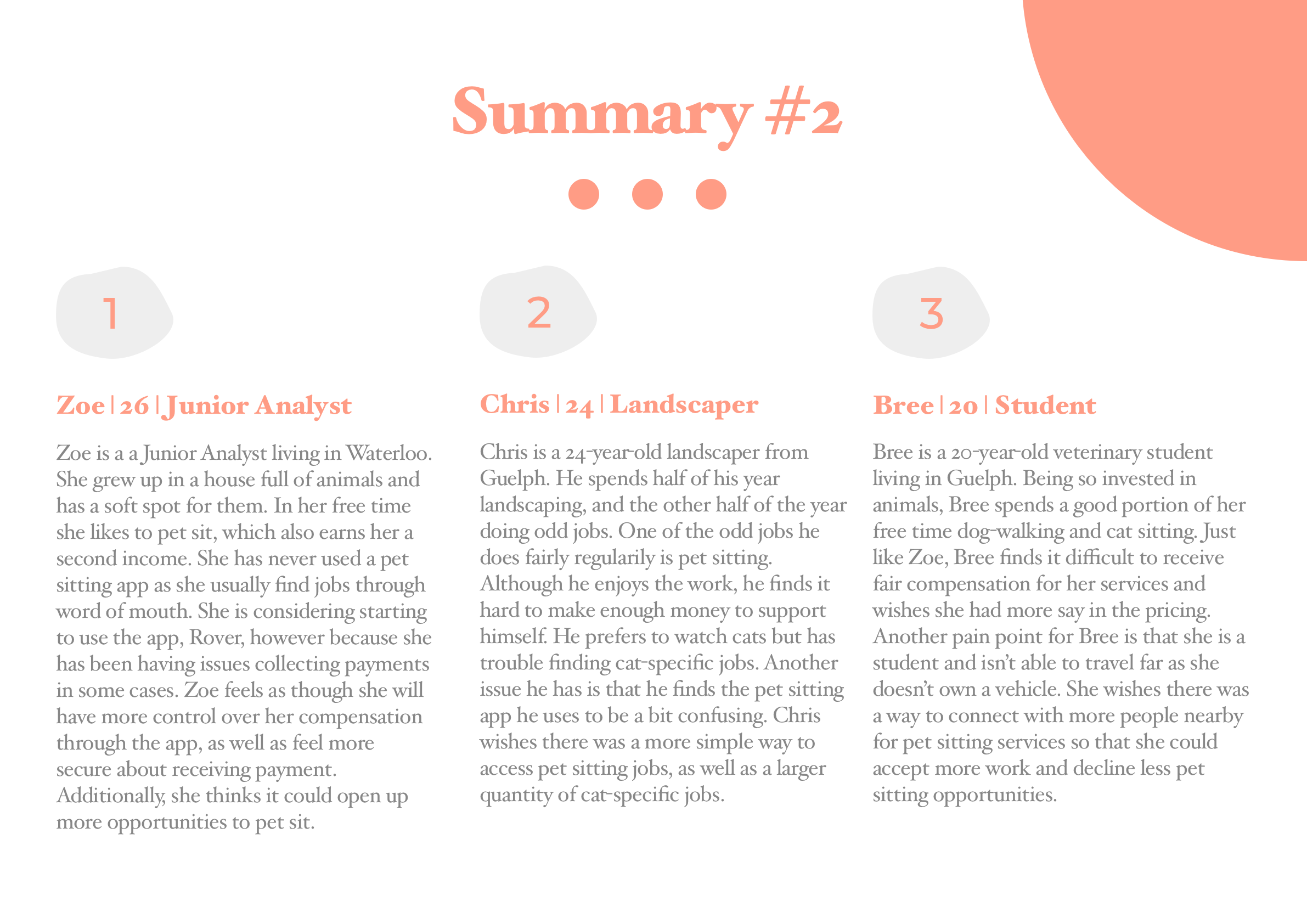
Interviews
My objective is to uncover the motivations, pain points, and overall goals of cat-owners and pet-sitters today. Additionally, I hope to gain insight into common themes relating to the problem space.
Criteria
The first group of interviewees were Canadian cat-owners aged 18 – 35 who have used a cat-sitting service before. The second group of interviewees were Canadian pet-sitters, either part-time or full-time, aged 18 – 35. Three individuals from each group were interviewed over Zoom video call.
Key Themes
After completing user interviews, reviewing my notes, and synthesizing the content, I was able to identify 6 main themes…
Scheduling
A common pain point for both cat-owners and pet-sitters is the difficulty surrounding scheduling. Appointments are typically posted just days before pet-sitting services are required.
Trustworthiness
Allowing someone that you barely know to enter your personal space while you’re away requires trust. Especially when they are taking care of what many consider to be a family member.
Communication
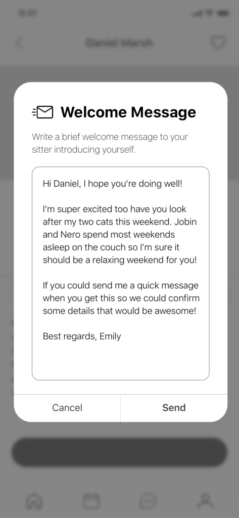
Cat-owners found that their anxiety was drastically reduced when they could keep in touch with the sitter and receive updates. Conversely, sitters found it difficult to contact the owners unless they used an app.
Personalization
Cat-owners showed a lot of interest in being able to customize the services they required from the pet sitter. For instance, being able to specify what time of day the visits would be or what times to feed the cat.
Cat-Specific Sitters
Many of the interviewees had used the app “Rover” previously. However, they expressed concerns that the app was mainly for dog sitting and that it’s likely the sitter would be a dog person simply accepting a cat sitting job for extra income.
Compensation
Pet sitters all seemed to experience the common theme of being underpayed. They often had little to no say in their compensation and, in some cases, received a different amount than initially agreed upon.
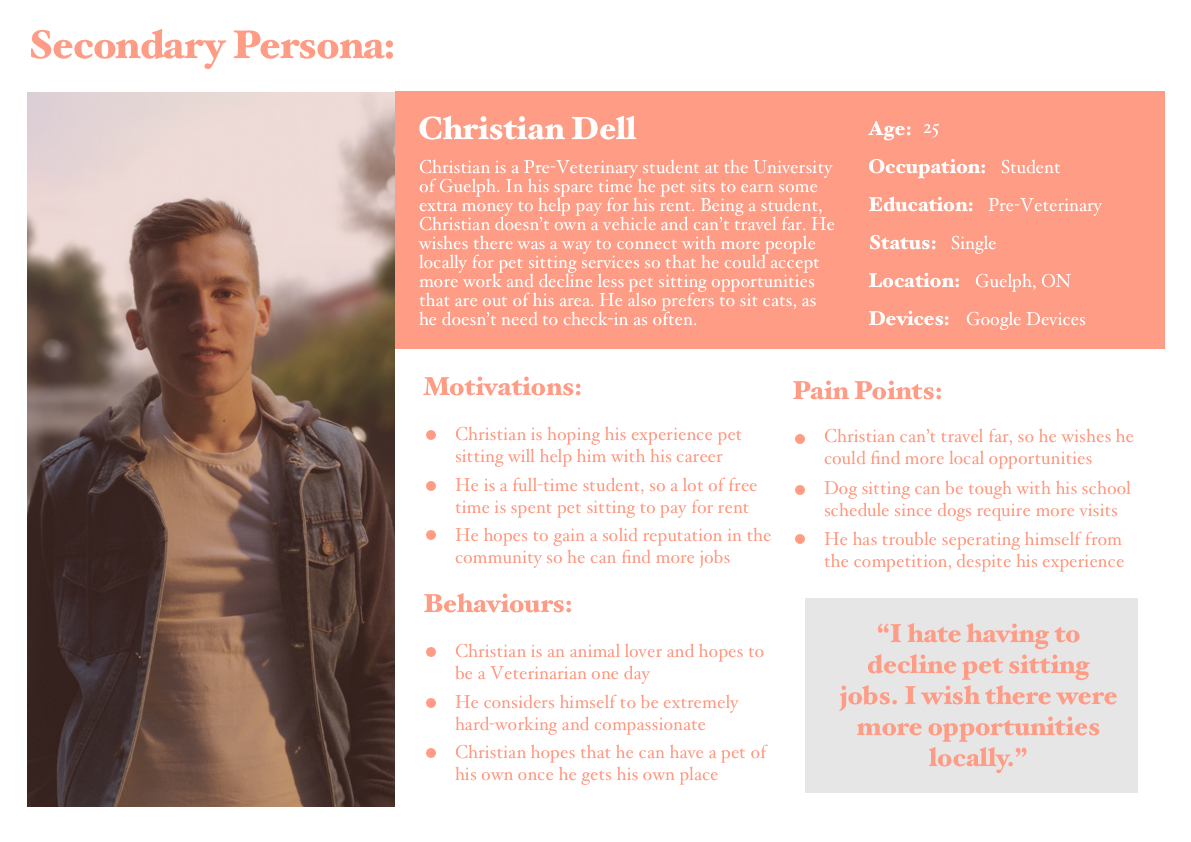
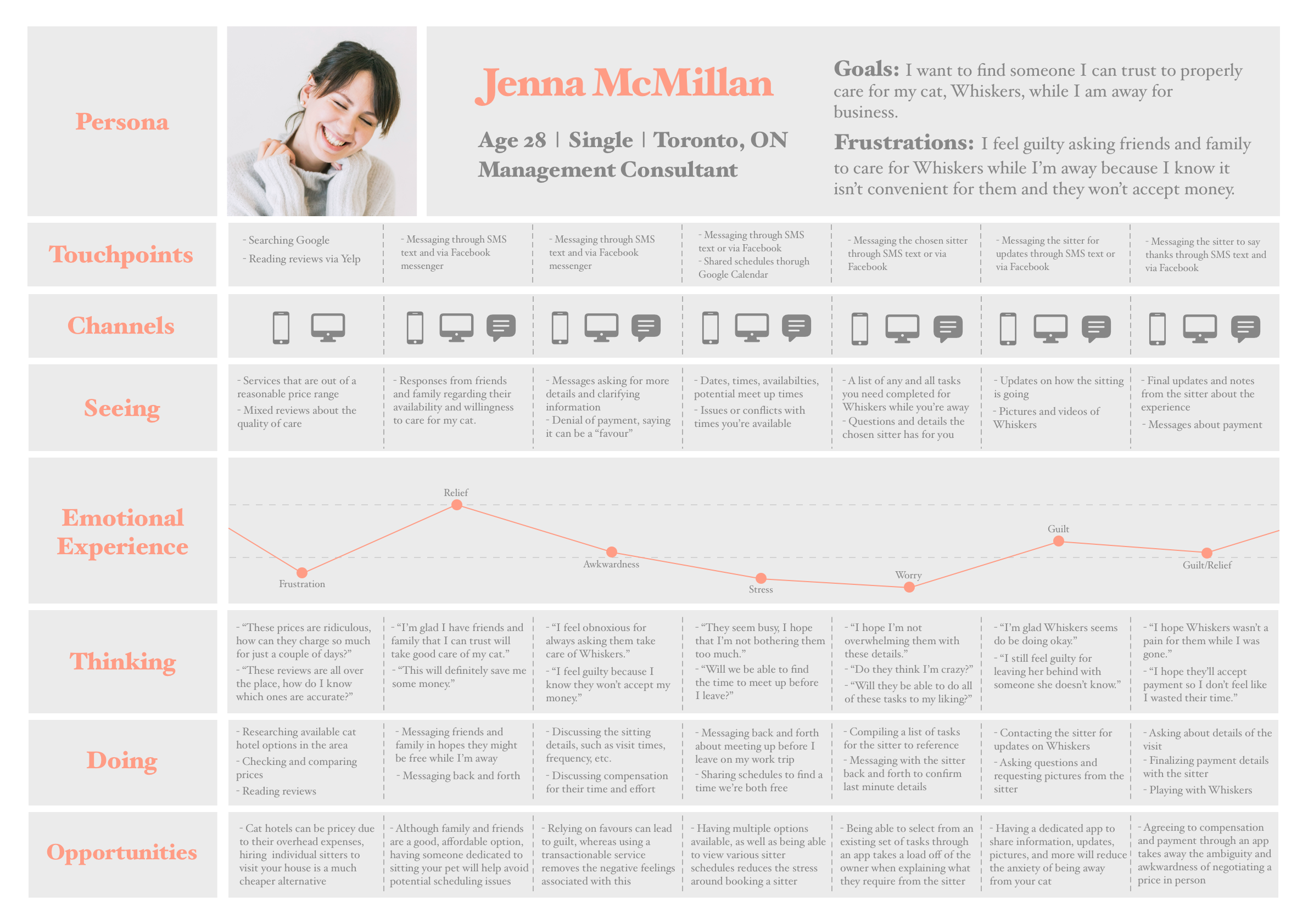
Personas & Experience Map
Ideation
Epics & User Stories
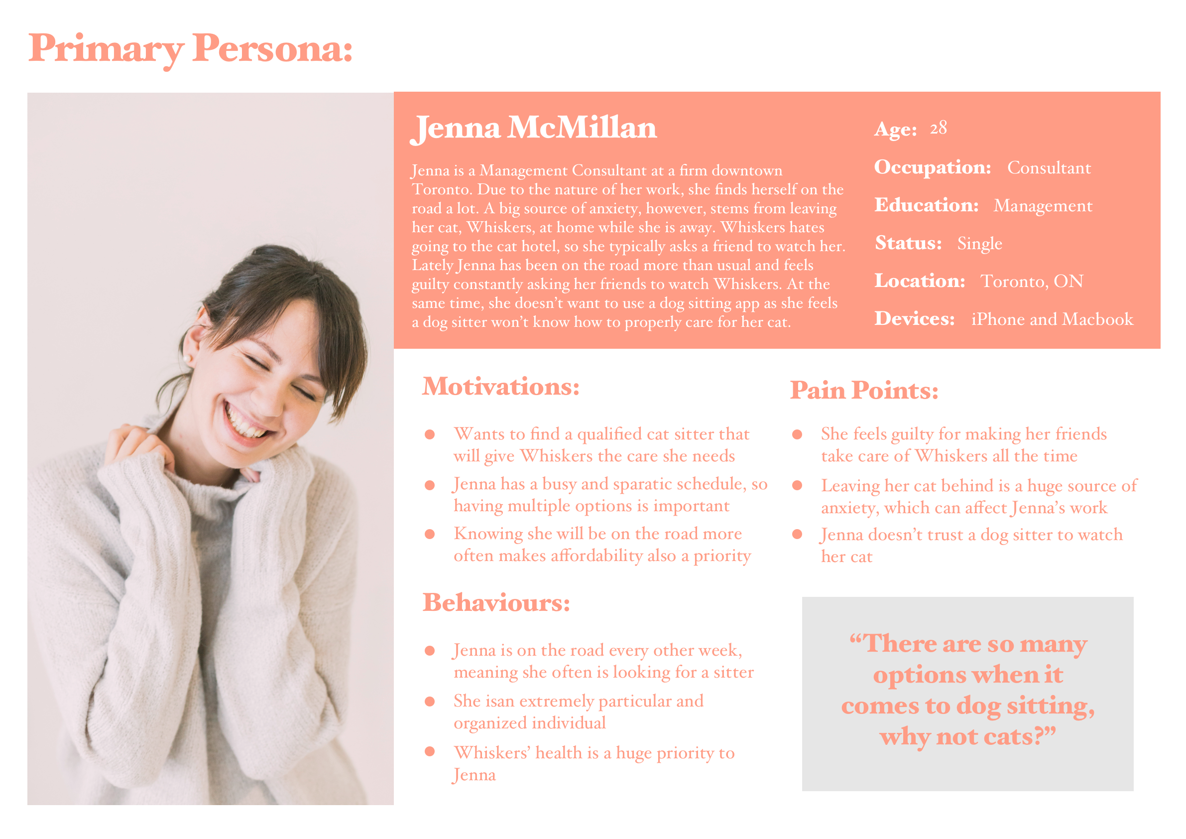
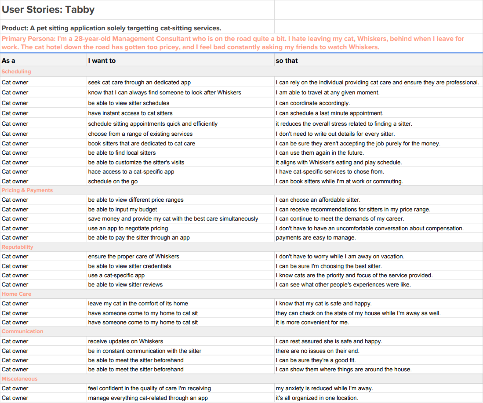
In order to gain a better understanding of the specific features needed for the app to be successful, I compiled a list of user stories and epics. Using the persona constructed during the first portion of this project, I was able to author user stories based off the frustrations, pain points, motivations, and goals of Jenna McMillan.
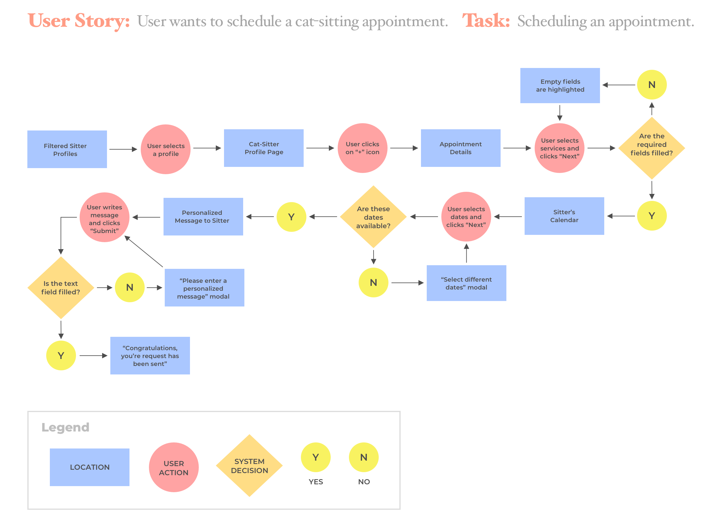
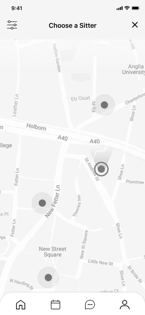
Primary Task Flow
After compiling a complete list of user stories, I then focused on building a primary task flow focused on the most prevalent epic. Of the 30 user stories constructed, over one third of them related to the epic of scheduling an appointment. Therefore, I decided to build my primary task flow around the feature of scheduling an appointment with a cat-sitter.
Concept Sketches
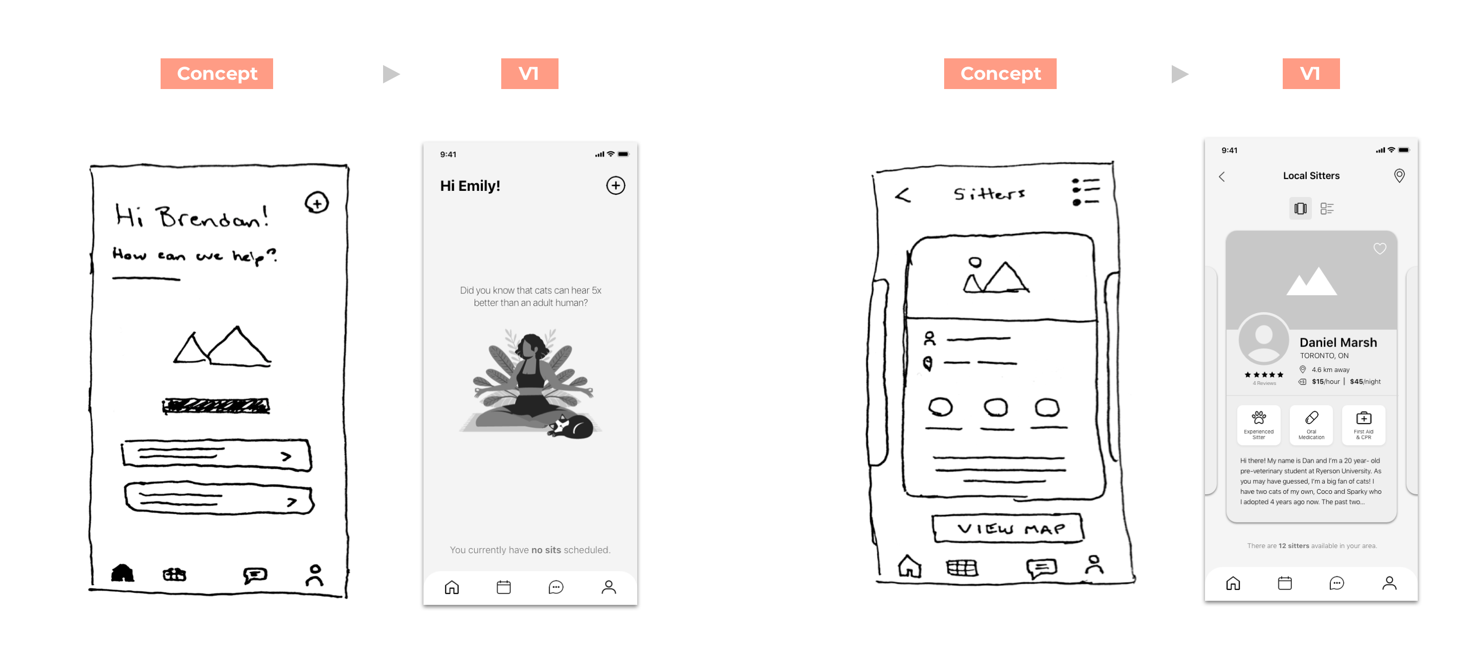
Once I had nailed down my core epic and primary task flow, it was time to put pen to paper and begin initial concept sketching. I sketched three unique low-fidelity wireframe flows of the process of scheduling an appointment with a cat-sitter. Through basic user testing using the Marvel POP application, I was able to narrow down my concept sketches to one wireframe.
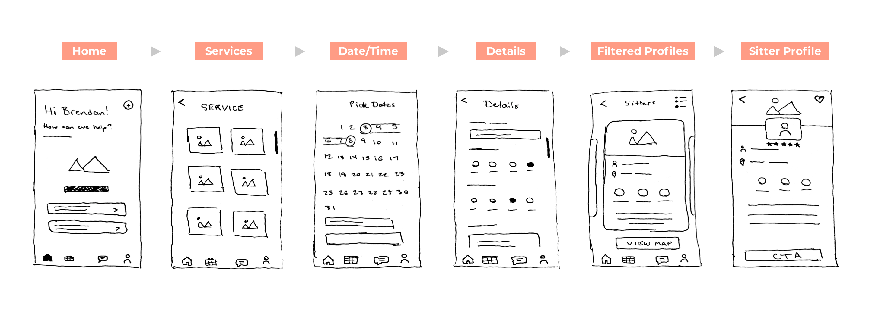
Digital Wireframes: V1
Using my initial concept sketches, I moved into Sketch and began digitizing the low-fidelity wireframes. The goal of this version one prototype was to start testing as quickly as possibly in order to identify user issues within the primary task flow.
User Testing: V1
The purpose of this interaction was to test the effectiveness, efficiency, and overall experience of scheduling a cat-sitting appointment through the app I designed. The tests shed light on the flaws or confusion in the process flow of the app. I tested 5 users within my demographic in order to obtain key feedback so that I could make improvements as I progressed. The overall goal was to provide a more optimal user experience.
Scenario
Imagine you work for a consulting agency and your boss notifies you that you need to fly to see a client later that week. However, you have a cat, Whiskers, at home and haven’t made any plans for someone to care for her while you’re away. Luckily, you have Tabby. You need to schedule an appointment for a cat-sitter to come stay at your home and watch Whiskers for a few days while you’re away. How might you go about completing this task?
Demographic
Interviewees will be Canadian pet owners aged 18 – 40 who have used a pet-sitting service before. I will be conducting 5 user tests with 5 individuals. All interviews will take place over a Zoom video call.
Round One Insights
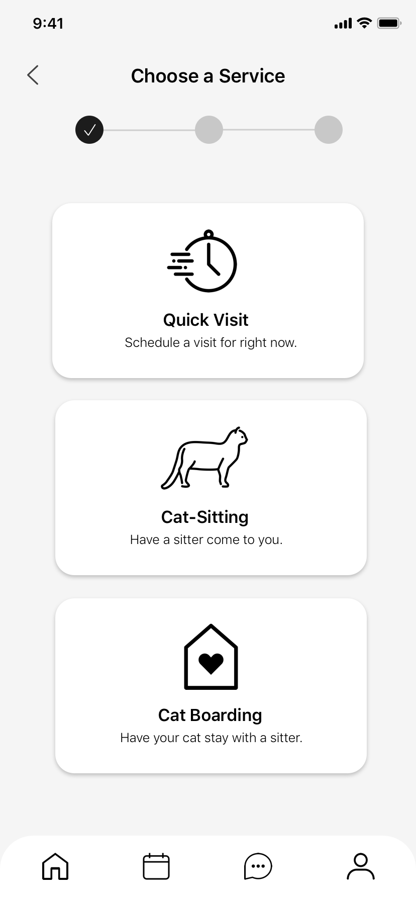
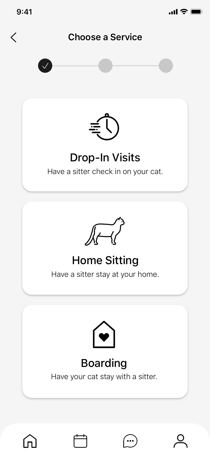
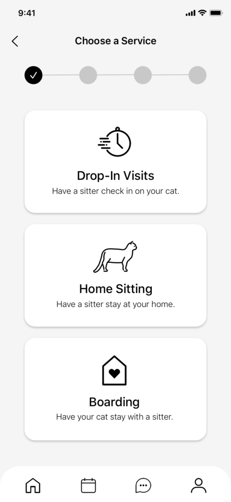
Service Cards
2 out of 5 users found the labelling of services to be confusing. More specifically, users were confused as to what the difference between “Quick Visit” and regular “Cat-Sitting” services was.
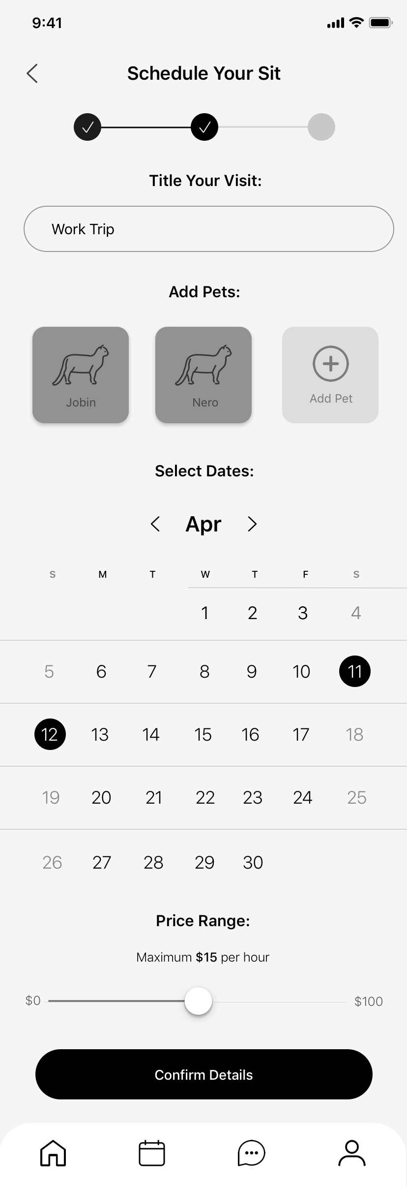
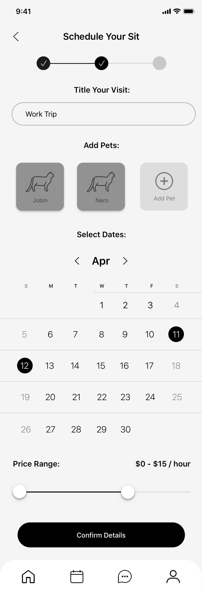
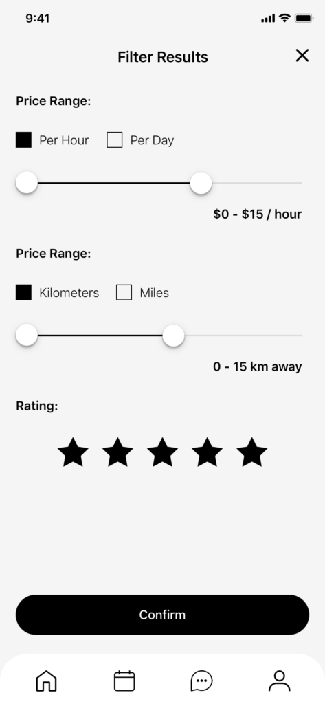
Price Range
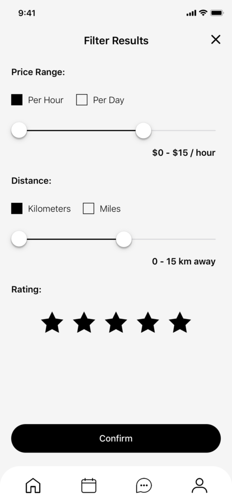
3 out of 5 users found the “Price Range” slider to be confusing as it only displayed a maximum price, not a range as stated.
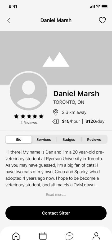
Font Size
3 out of 5 mentioned that the fonts found on both the sitter’s profile card and sitter’s profile page to be too small, causing eye strain.
Sitter Profiles
1 of the users mentioned that the label of “Oral Medication” was confusing, as they weren’t entirely sure what that referred to.
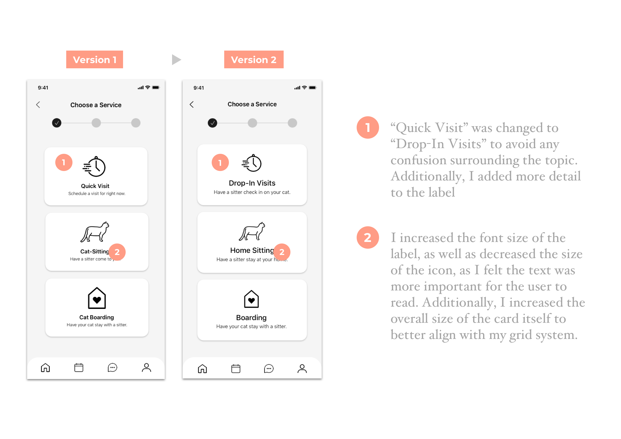
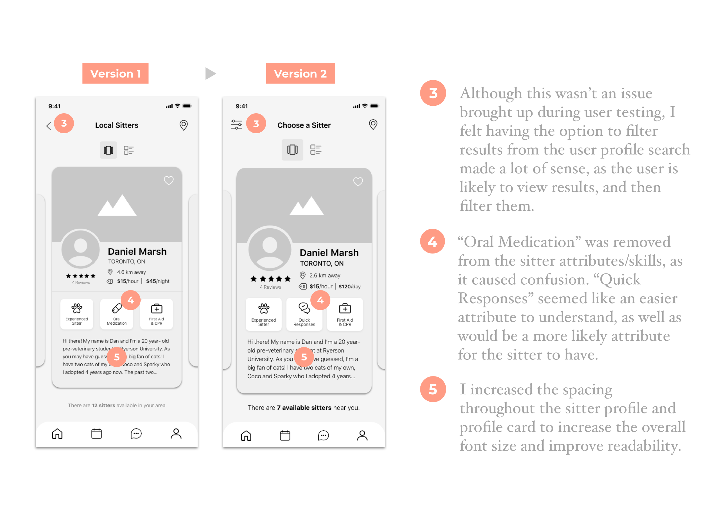
Digital Wireframes: V2
After gaining real life user insights through the first round of user testing I was able to iterate my prototype. By altering features and adding screens I produced a more user-friendly experience overall.

User Testing: V2
The purpose of this interaction was to test the effectiveness, efficiency, and overall experience of scheduling a cat-sitting appointment through the app I designed. The tests shed light on the flaws or confusion in the process flow of the app. I tested 5 users within my demographic in order to obtain key feedback so that I could make improvements as I progressed. The overall goal was to provide a more optimal user experience.
Scenario
Imagine you work for a consulting agency and your boss notifies you that you need to fly to see a client later that week. However, you have a cat, Whiskers, at home and haven’t made any plans for someone to care for her while you’re away. Luckily, you have Tabby. You need to schedule an appointment for a cat-sitter to come stay at your home and watch Whiskers for a few days while you’re away. How might you go about completing this task?
Demographic
Interviewees will be Canadian pet owners aged 18 – 40 who have used a pet-sitting service before. I will be conducting 5 user tests with 5 individuals. All interviews will take place over a Zoom video call.
Round Two Insights
Scheduling
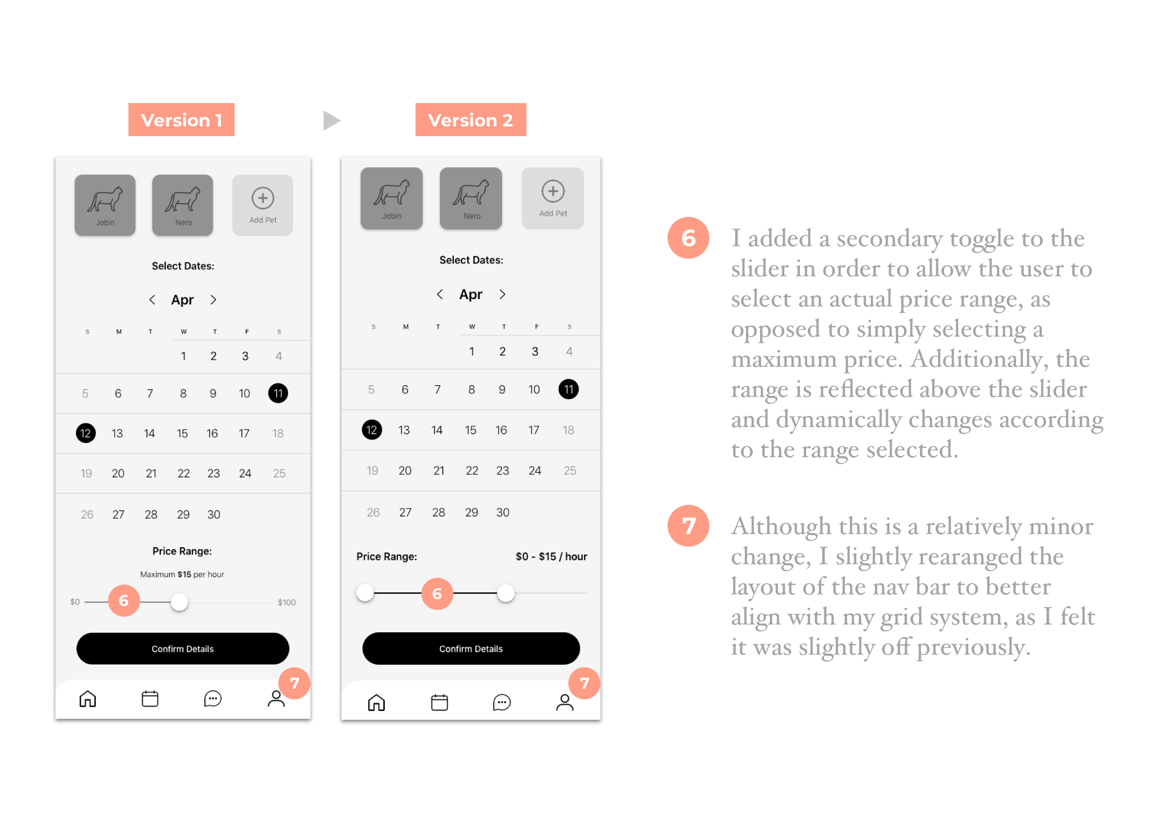
2 out of 5 users mentioned that there was too much content for just 3 steps of scheduling and that it should perhaps be broken up. Additionally, users had trouble with scrolling on this specific page and suggested breaking up the content may help reduce confusion.
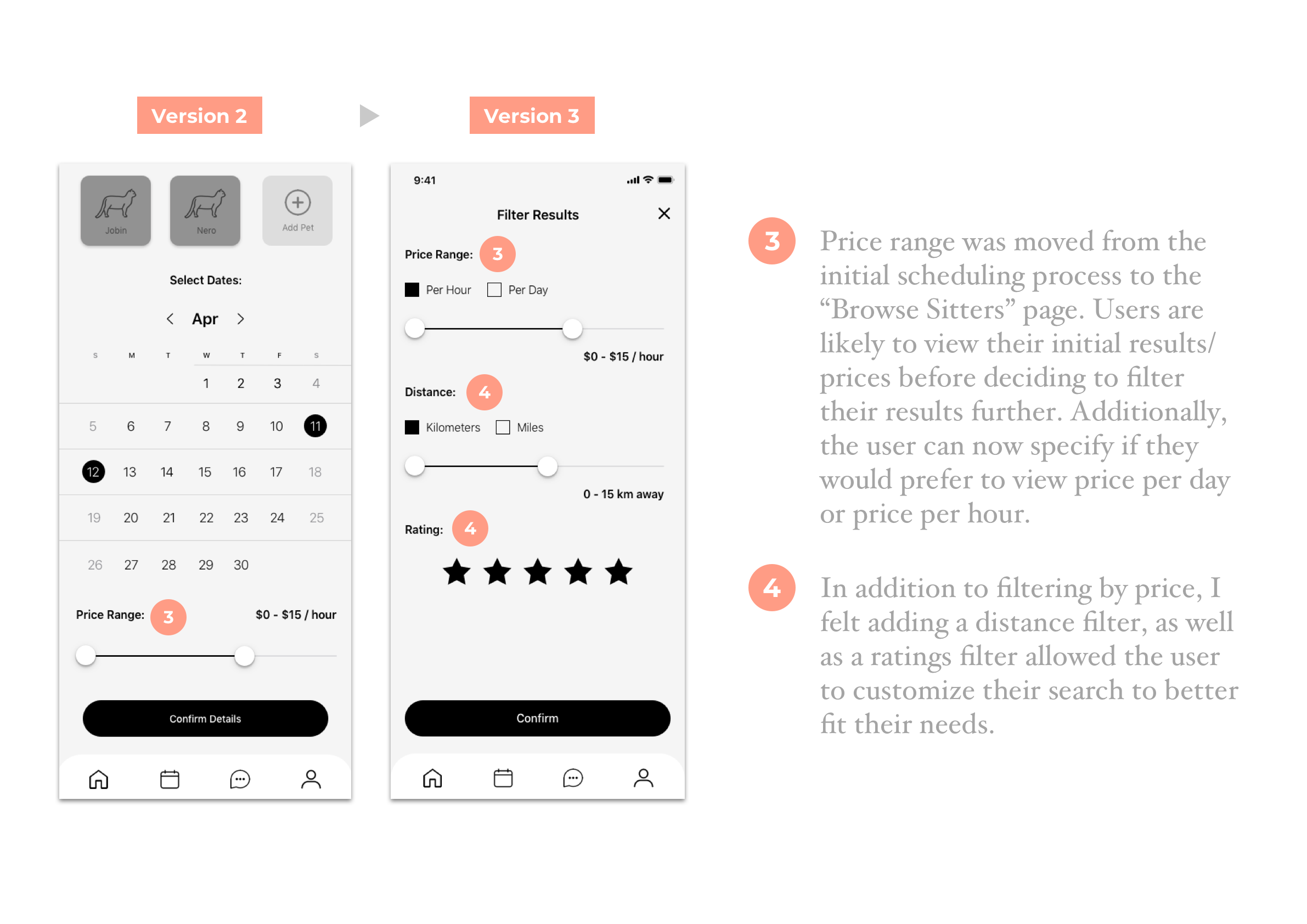
Price Range
1 of the users mentioned that price range would perhaps be more effective if it were located on the cat-sitter “browse” page, as people are likely to filter things like price after viewing the initial results of their search.
UI Design
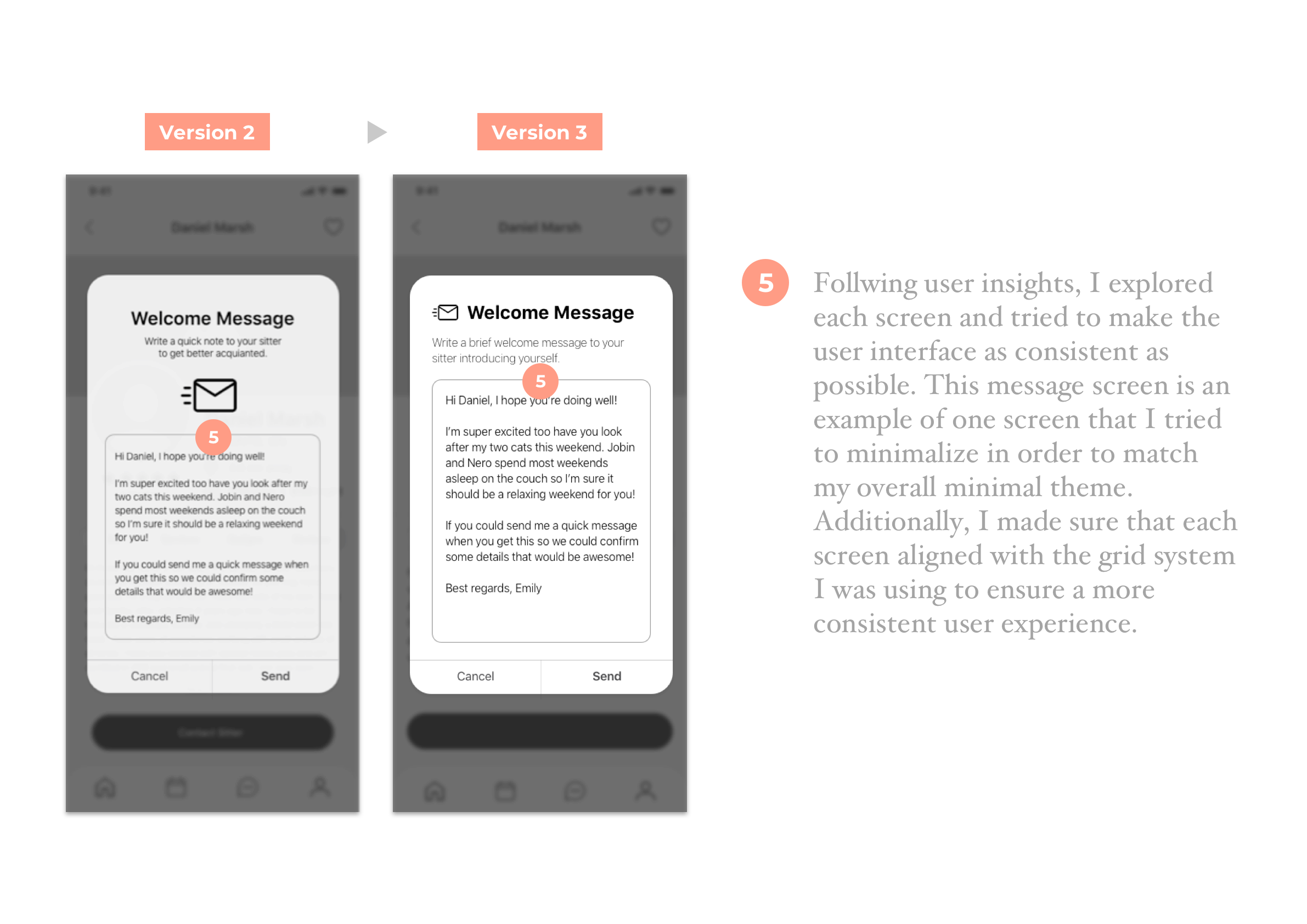
1 of the users mentioned that the UI could be slightly more consistent throughout the design. There were some screens that he felt stood out more than others. This was mentioned during the second half of the scheduling process.
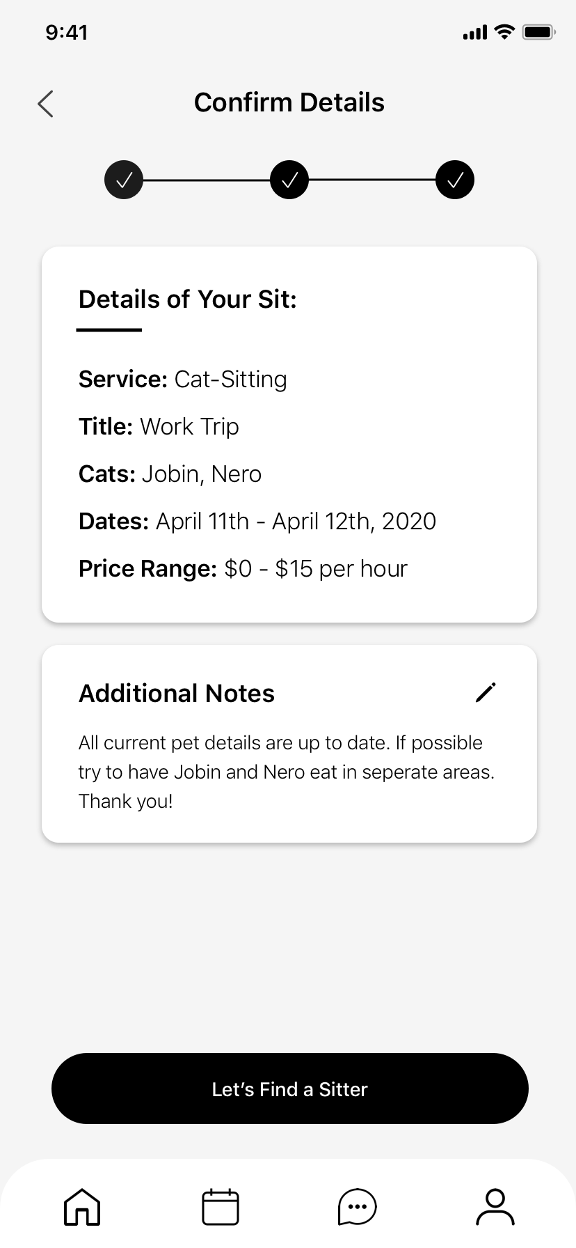
Logic of Flow
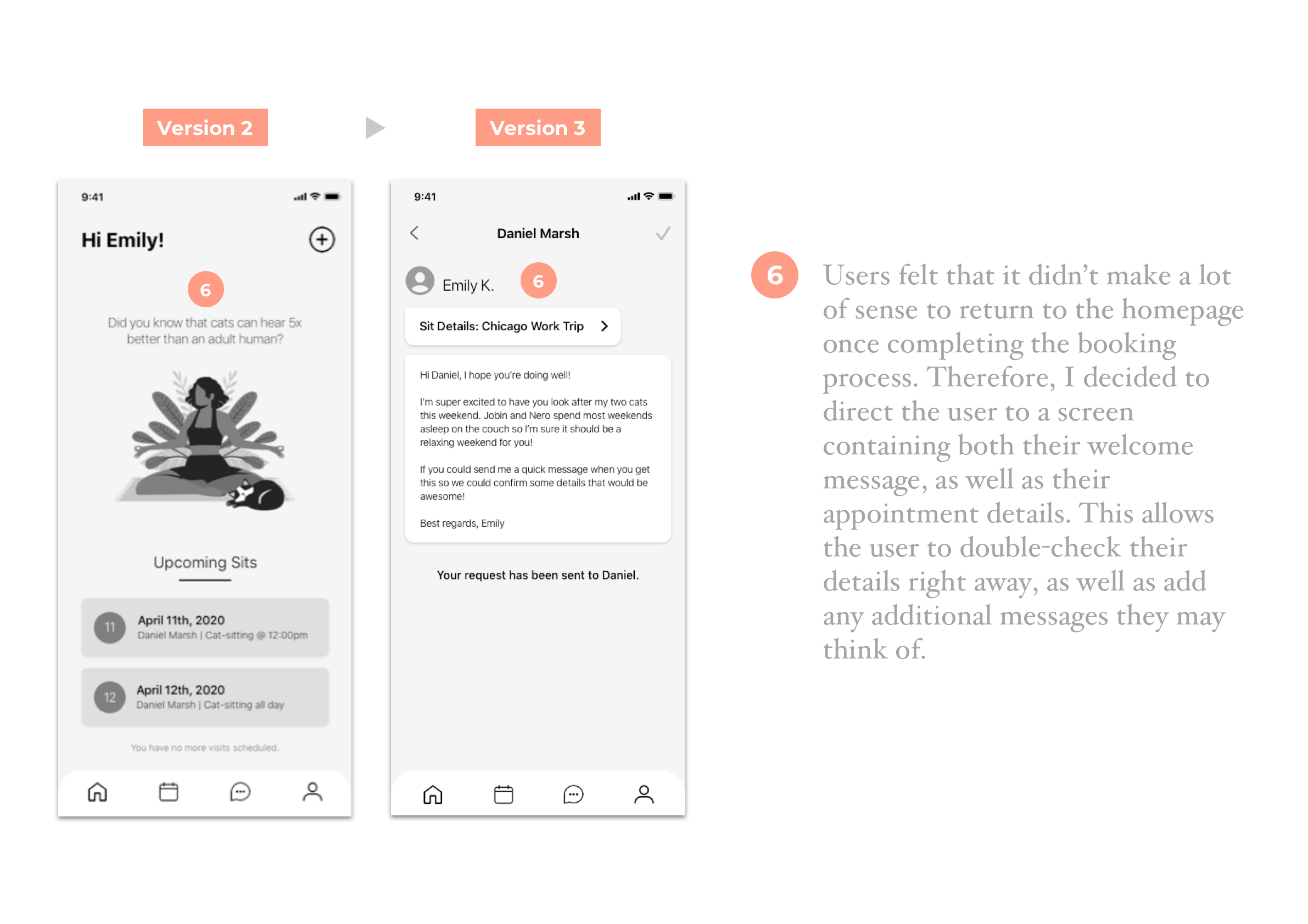
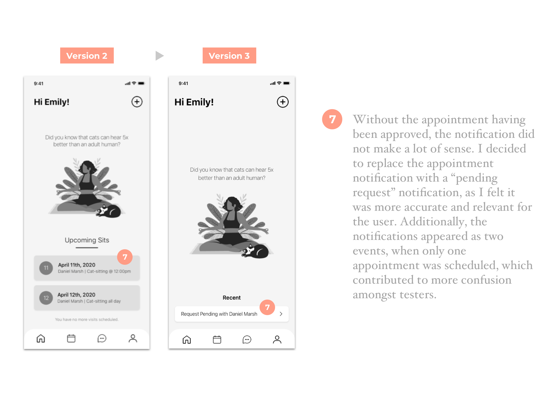
2 out of 5 users mentioned that they felt the end of the scheduling process should lead to either messages or appointment details, as opposed to the home screen.
Notifications
2 out of 5 users mentioned that they felt the notifications on the home screen could be combined into one notifications, as they appeared as two separate events.
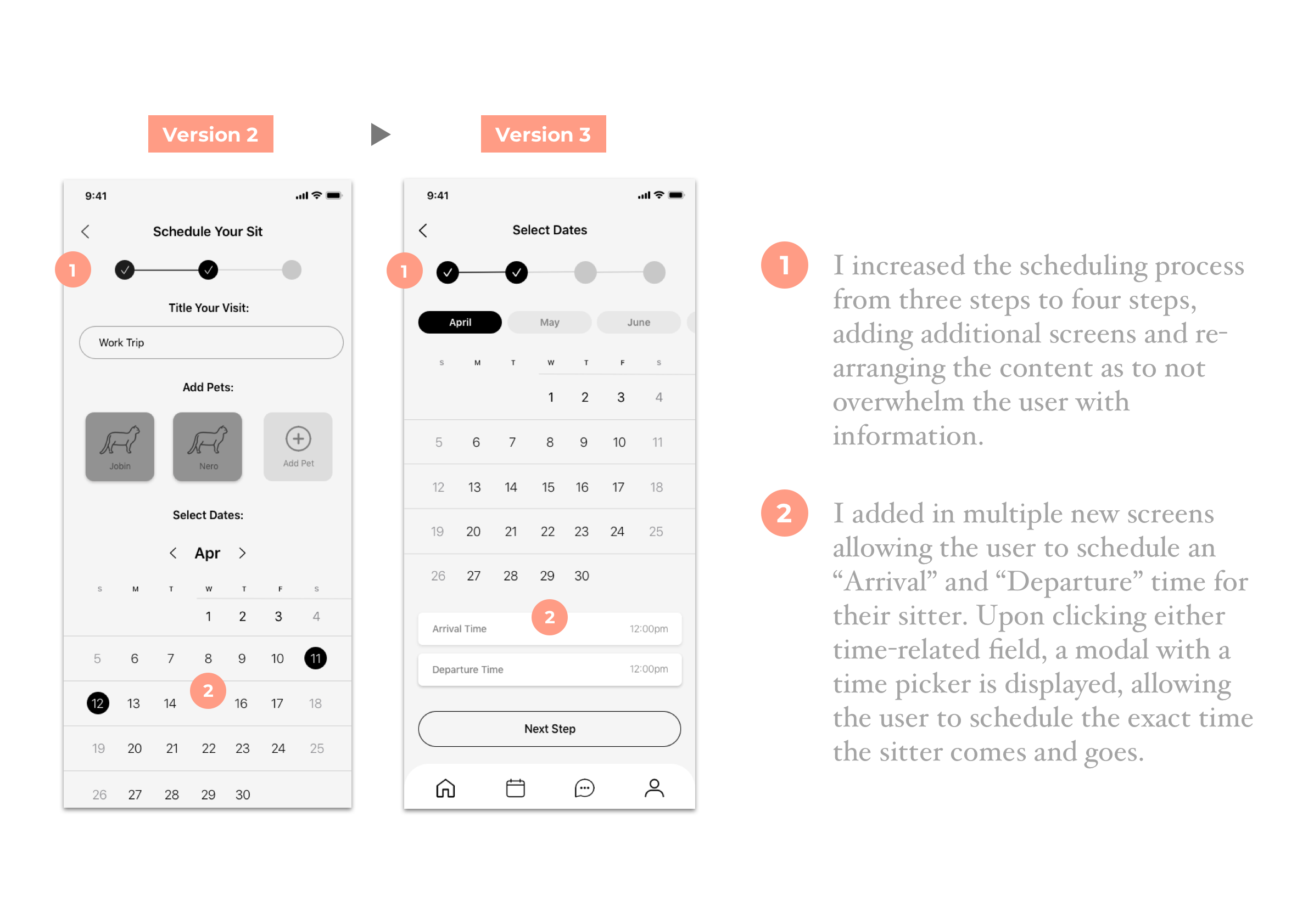
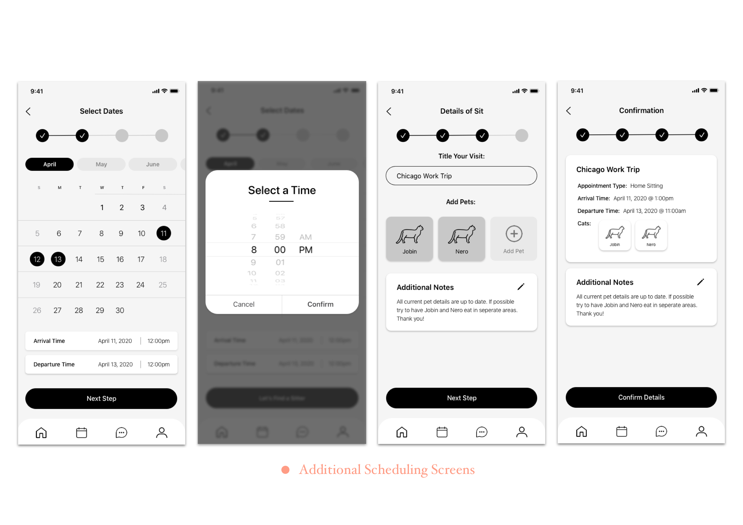
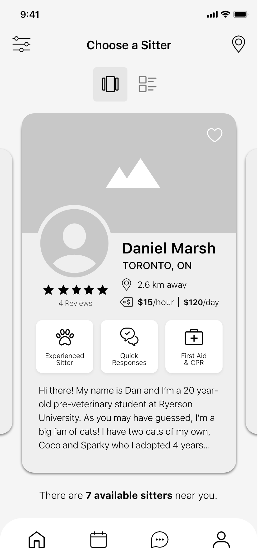
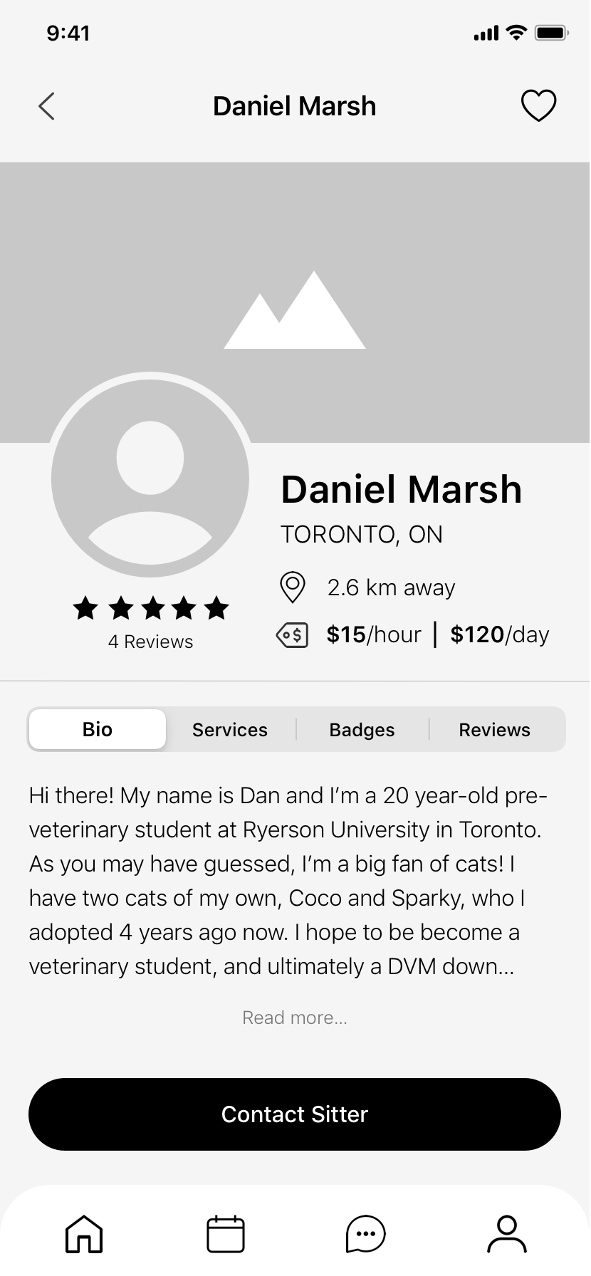
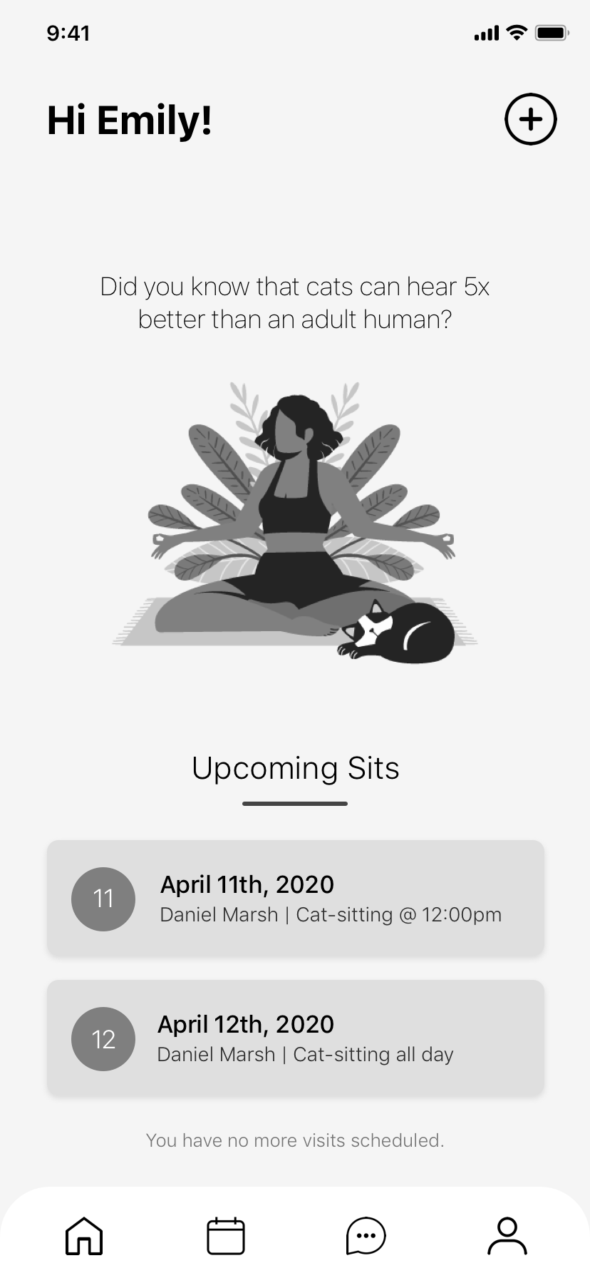
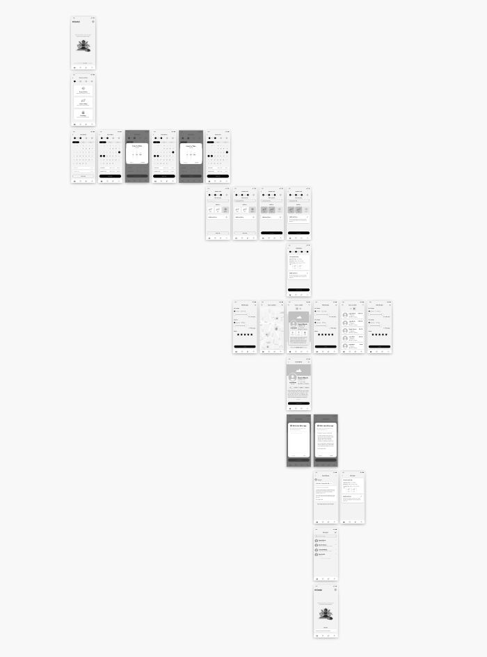
Digital Wireframes: V3
Over two rounds of user testing I was able to gain a considerable amount of insight. Through multiple iterations and additional screens, as well as re-working my task flow, I was ultimately able to produce my final, mid-fidelity prototype.


Prototype
Visual Identity
Once I had established the final mid-fidelity wireframe, it was time to explore the visual identity for my product. I began by constructing a list of adjectives that I felt represented the brand well.
Playful
Warm
Friendly
Light
Connected
Minimal
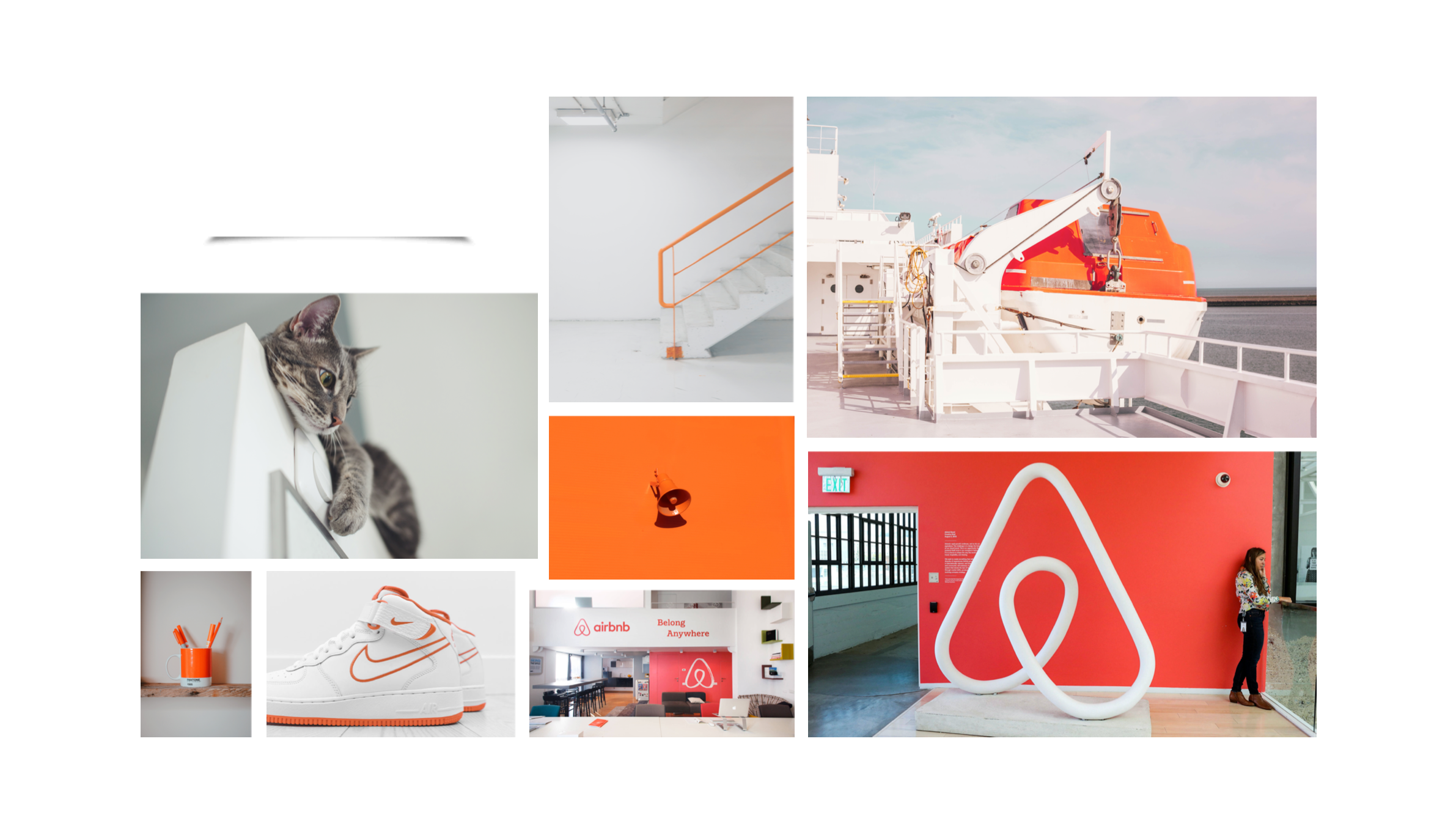
Using the list of adjectives I constructed, I was able to begin putting together a mood board.
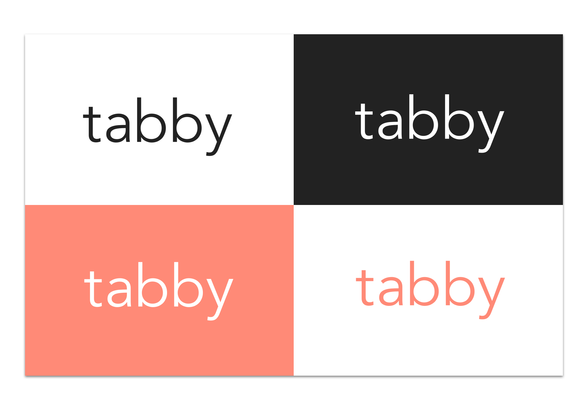
After lengthy consideration of multiple brand names, I landed on the name “Tabby”. A tabby cat is the most commonly known cat breed in North America, making it easy to connect the brand name to the service of cat-sitting. Additionally, I felt the word was pleasant and simple, just like the product itself.
Multiple wordmarks were considered while building the brand identity. I wanted to create something simple and minimalist to reflect the product design, while also making a statement. I ultimately decided to go with Avenir Next, a simple geometric sans-serif typeface. I also made some minor adjustments to the lettering and kerning.
App Logo & Icon
I wanted my app icon to include either a cat, or something directly related, as it needs to be evident what the app is for without the word “Tabby” present. I also wanted the icon to be thin and minimal to match the app design.
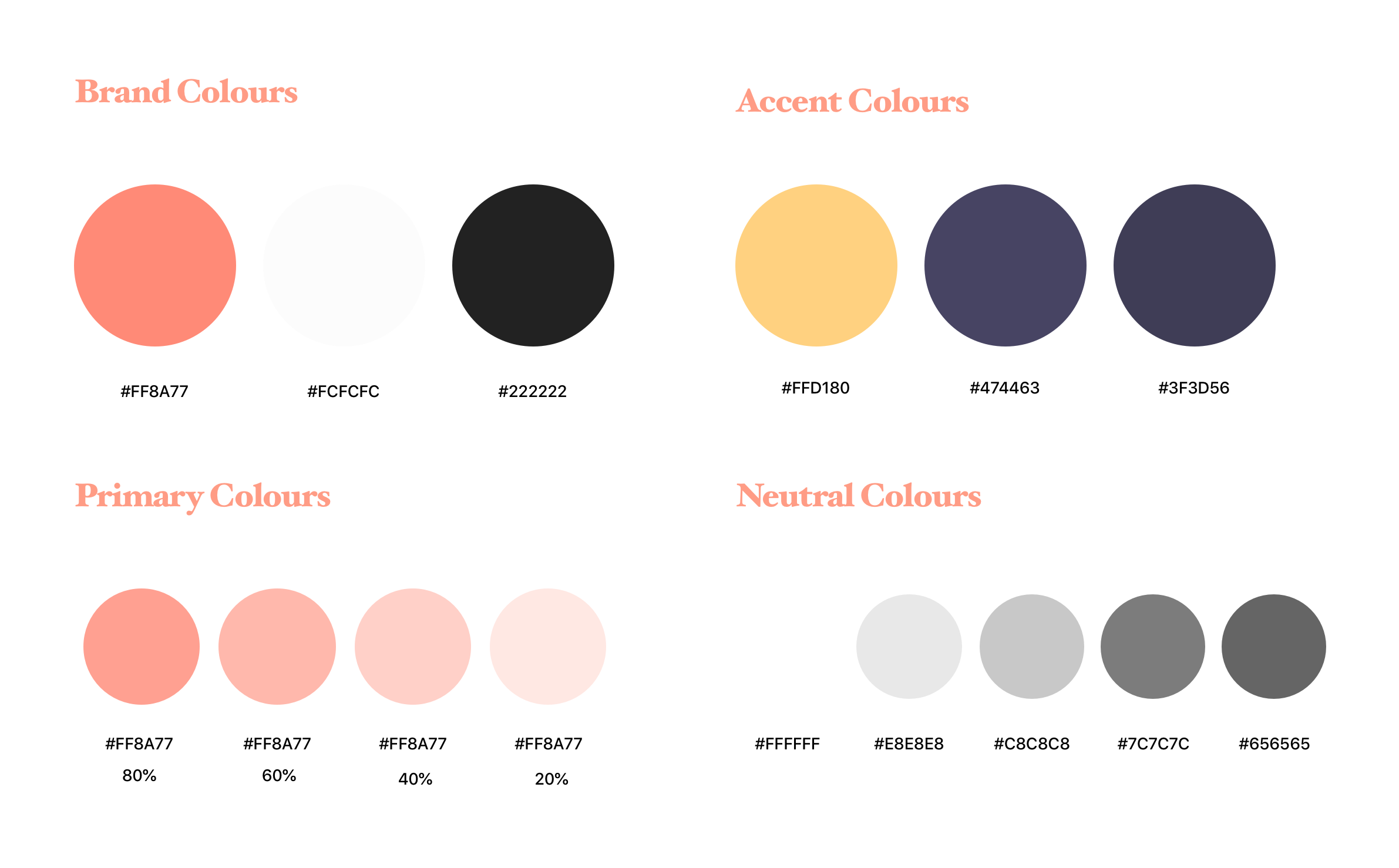
Colour & Typography
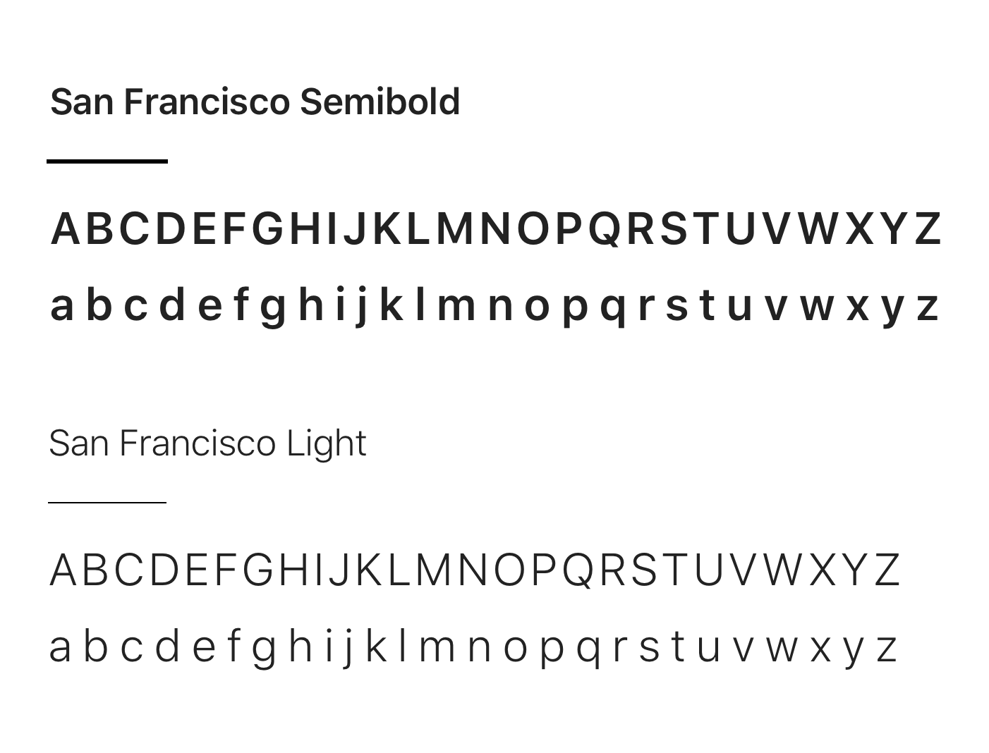
The colour scheme used primarily throughout the application is a monochromatic vibrant coral. In terms of typeface, tabby uses “San Francisco”. The San Francisco typeface is a neo-grotesque sans-serif made by Apple Inc.
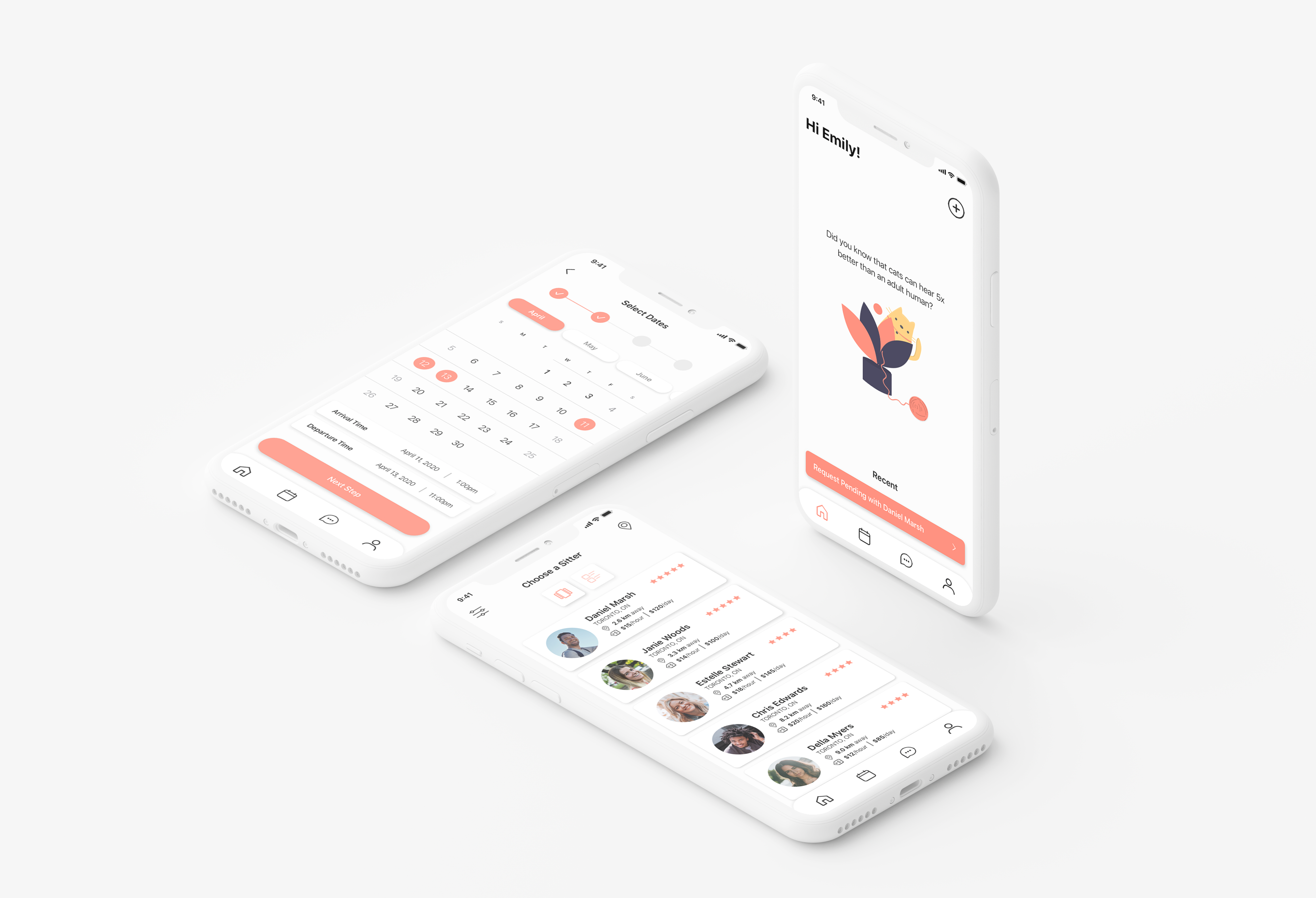
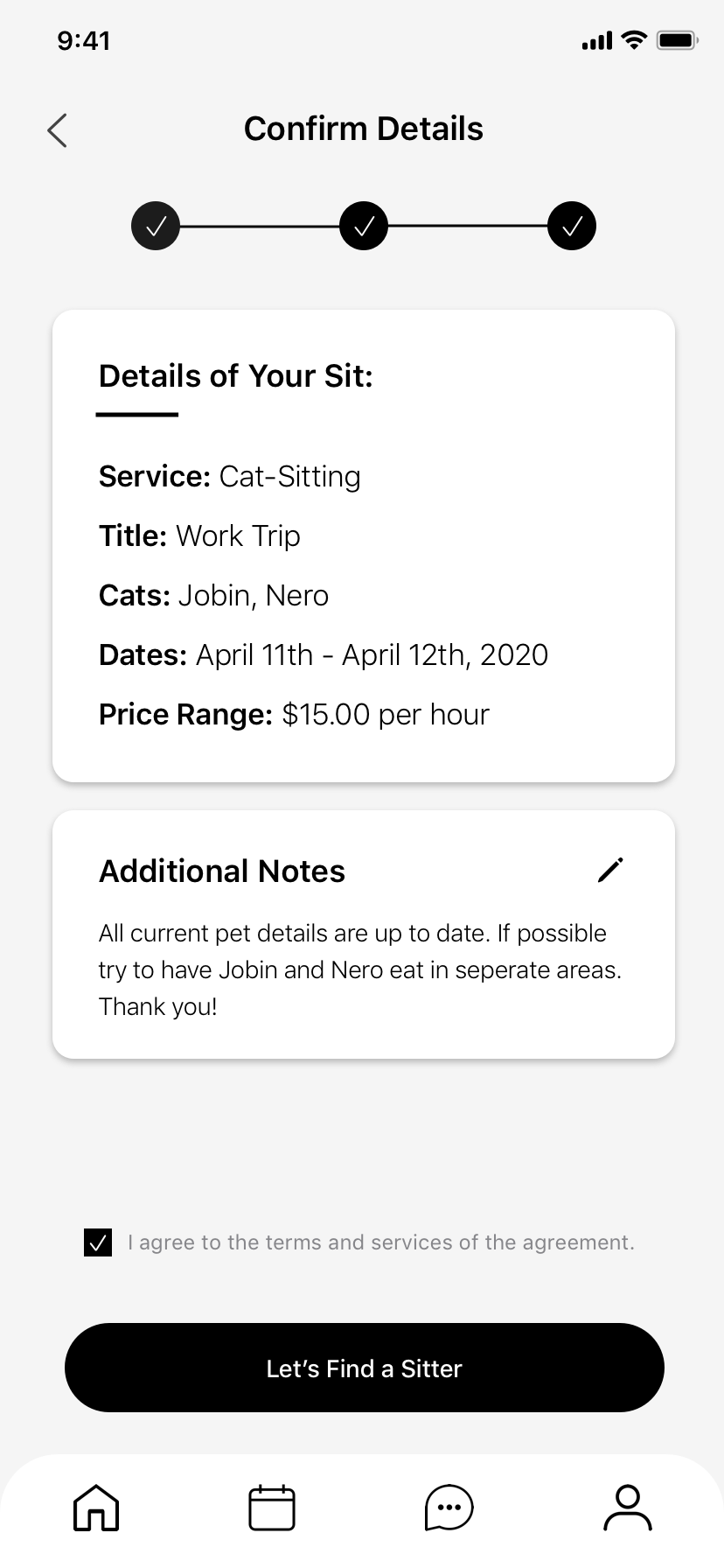
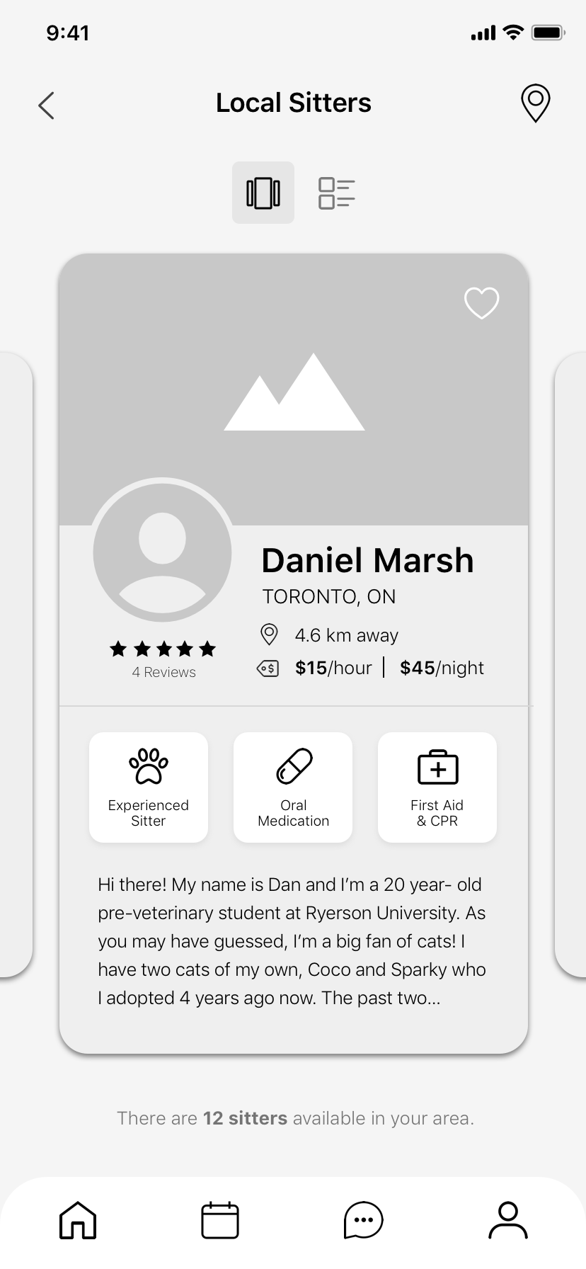
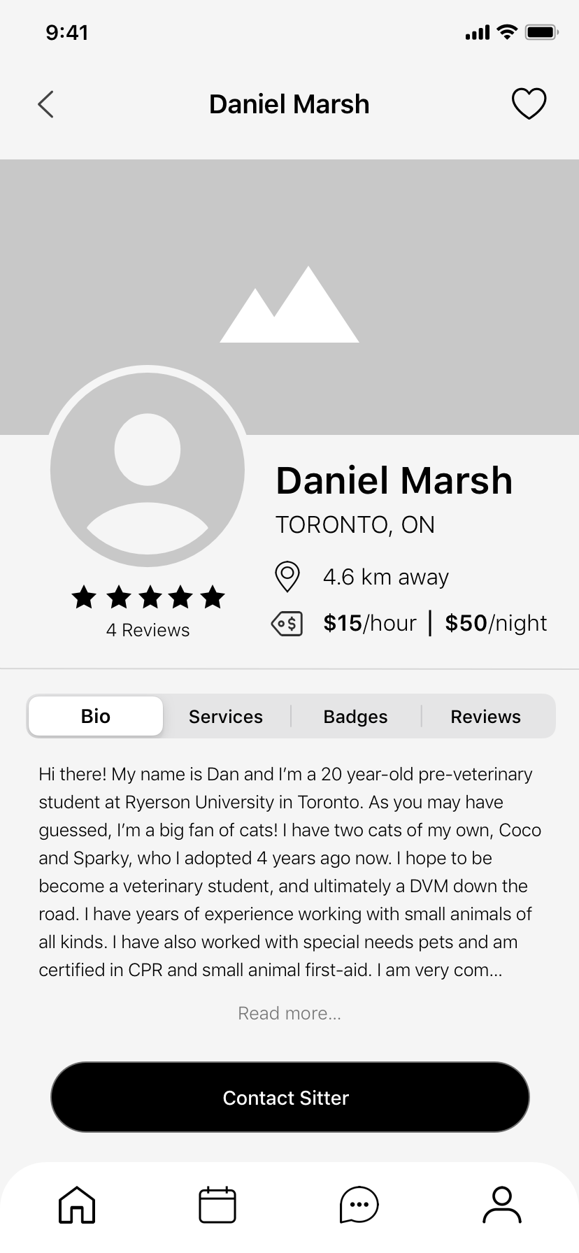
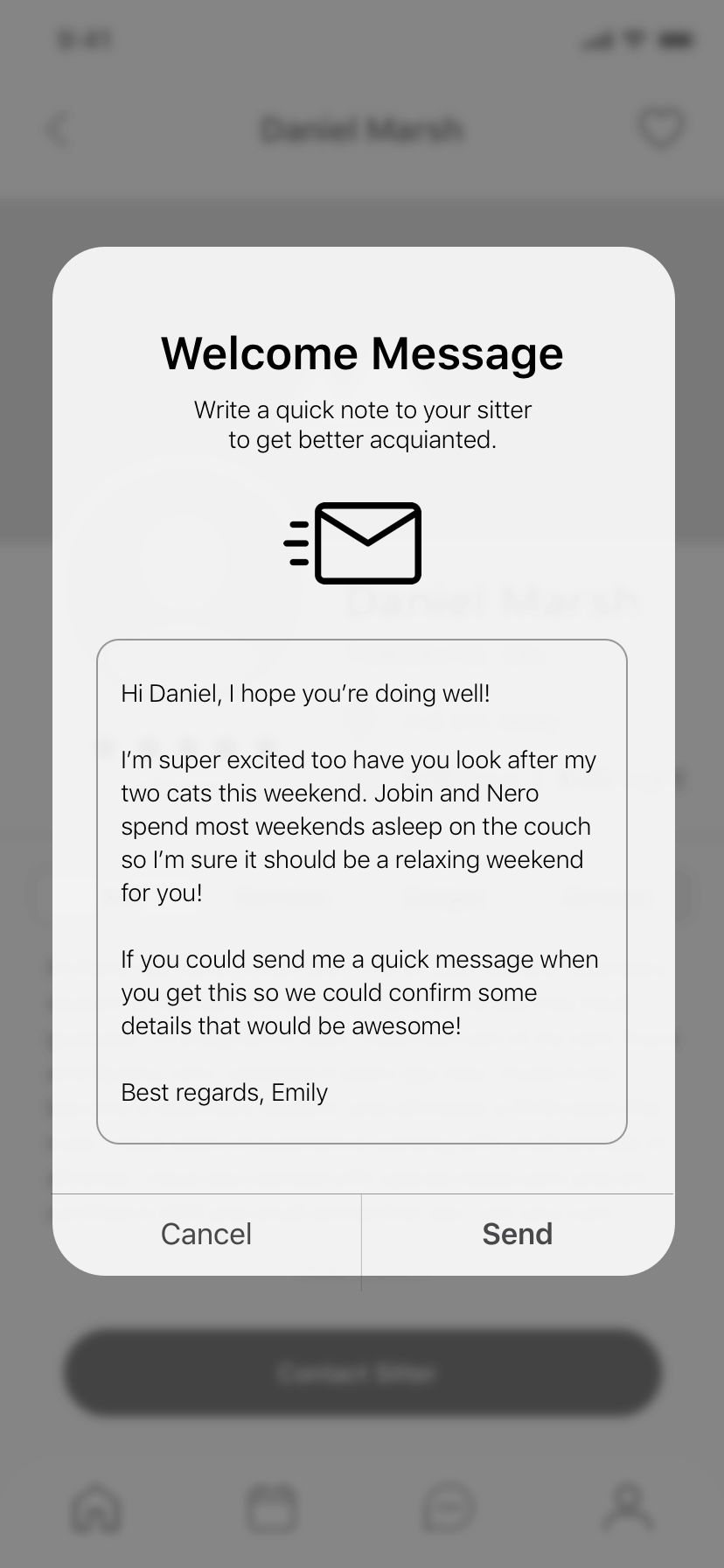
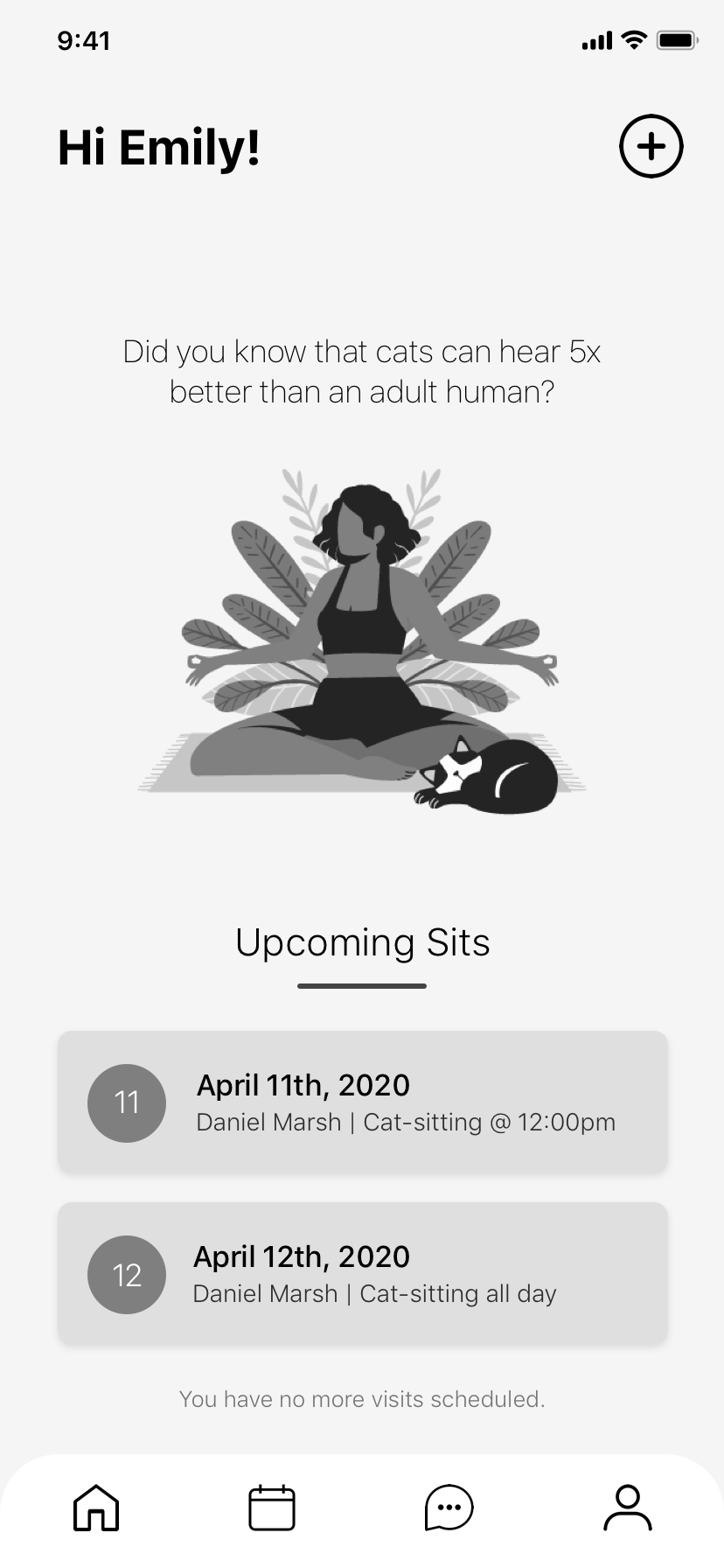
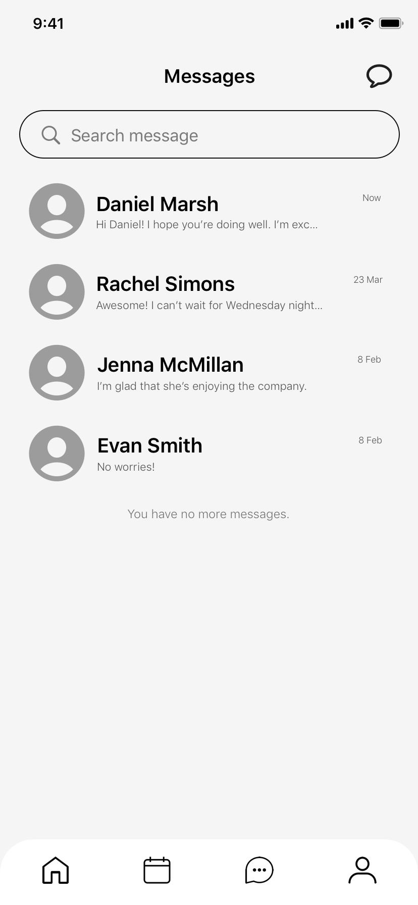
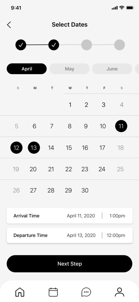
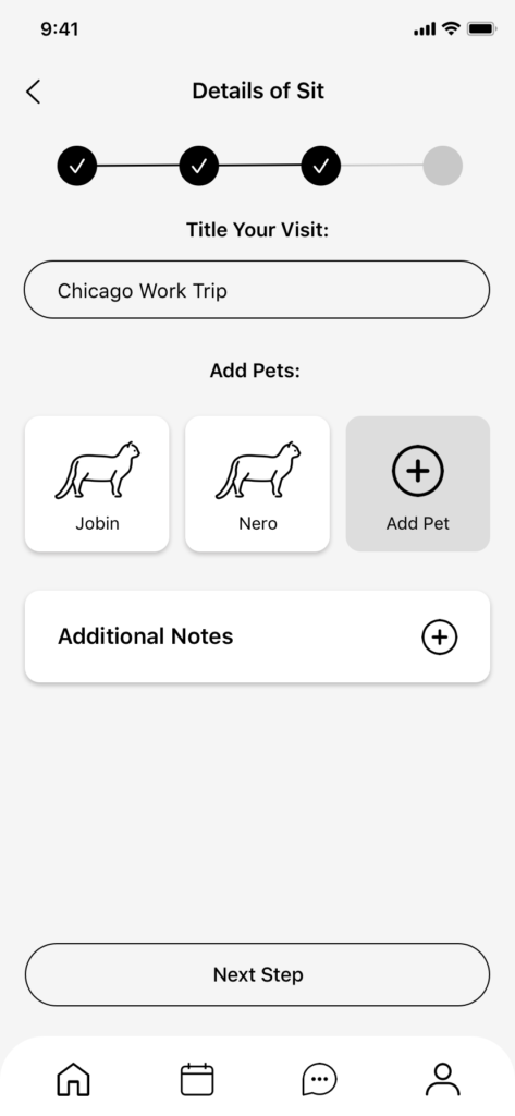
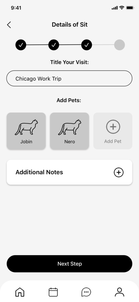
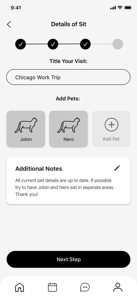
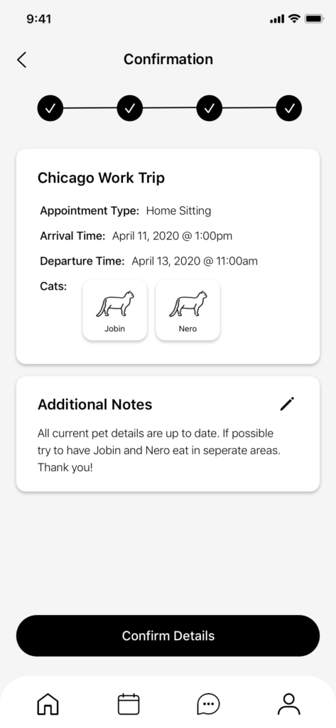
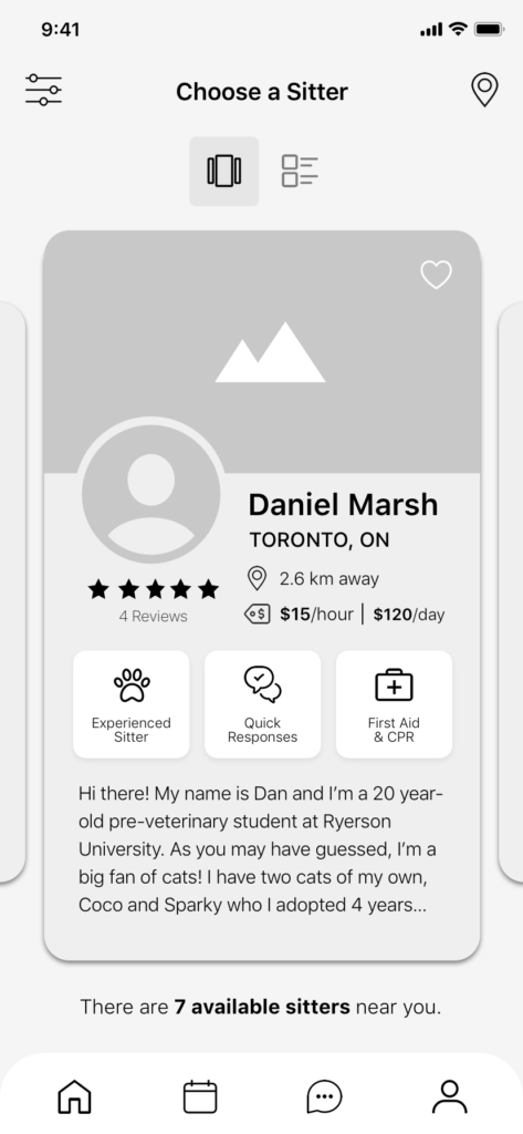
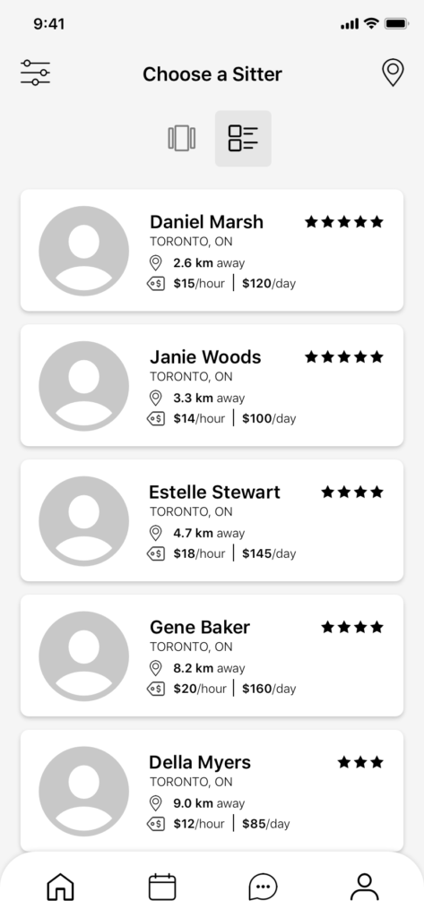
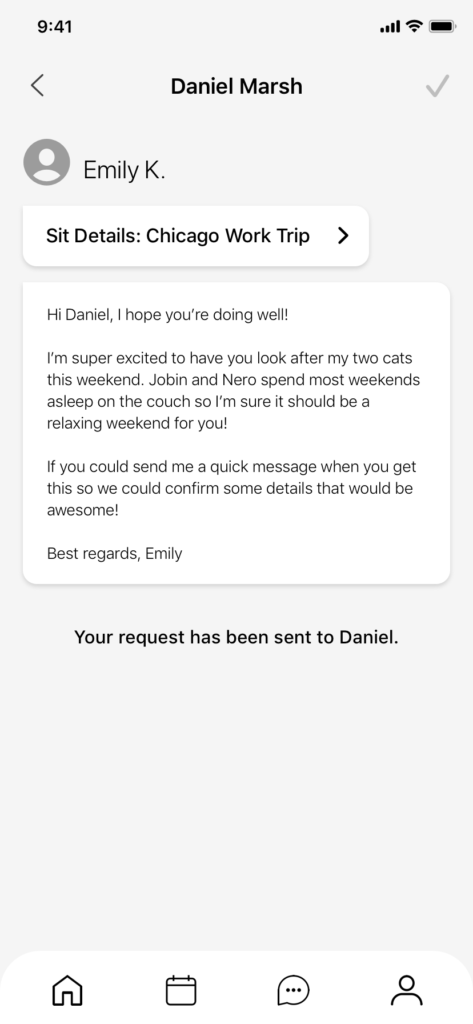
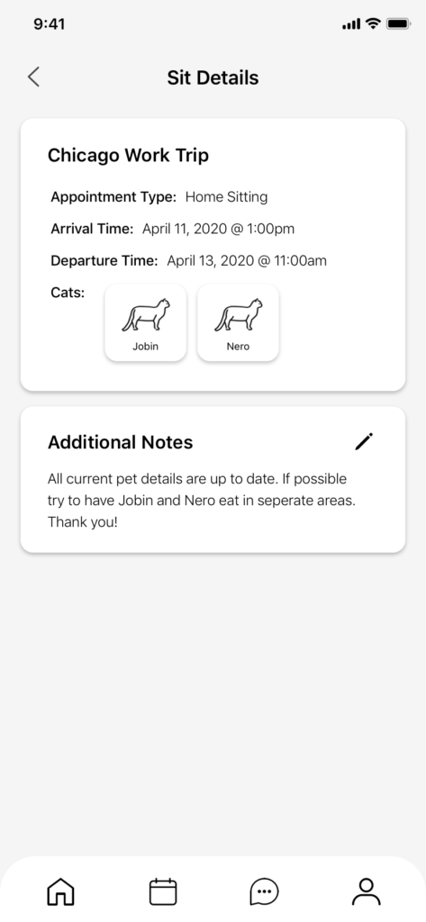
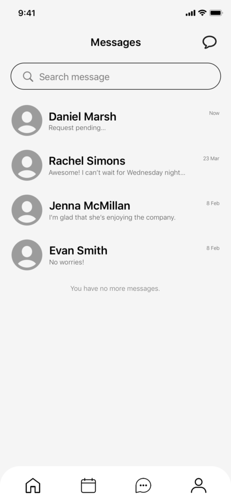
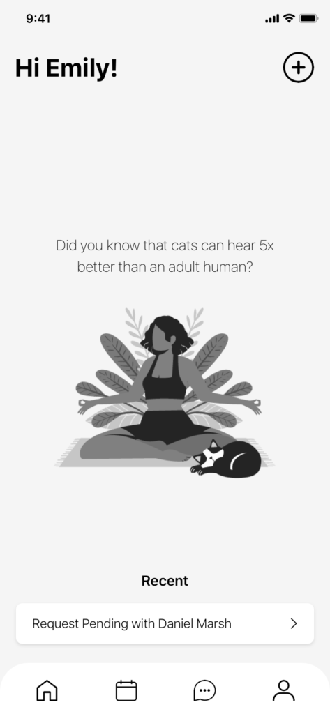
High-Fidelity Prototype
tabby
After completing one concept wireframe, three mid-fidelity prototypes, and two rounds of user testing, I was able to produce a high-fidelity prototype of Tabby. The primary task flow is scheduling an appointment with a cat-sitter to come stay at your house while you’re away.
Marketing Website
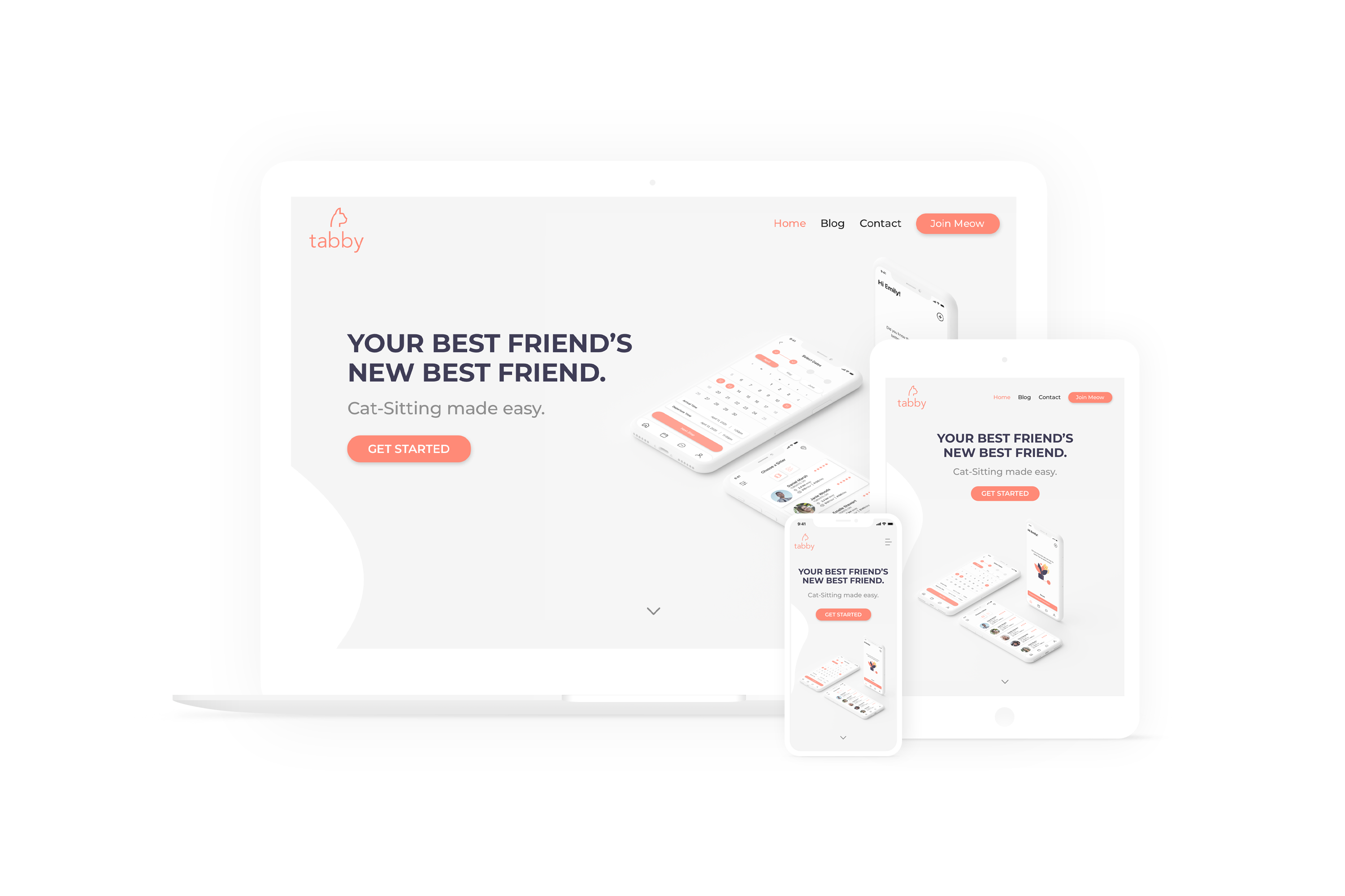
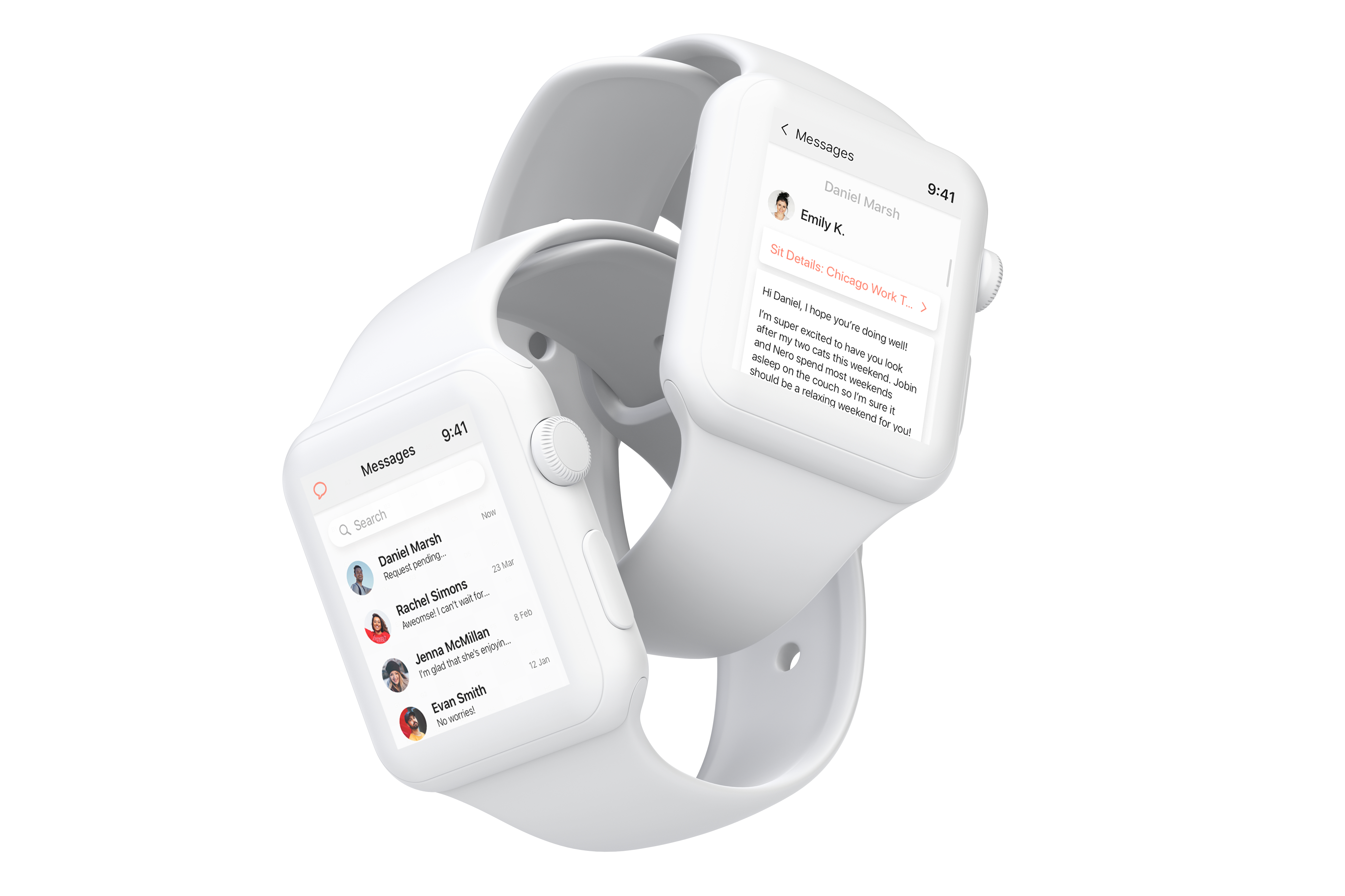
Alternative Platform
In addition to designing a responsive marketing website for desktop and mobile, I also decided to design various screens for a Series 5 44mm Apple Watch. I felt that an Apple Watch would be a great alternative platform for Tabby, as most of the users are on the go or busy with work. Having the app available on a watch allows for more flexibility of use for the user when checking in on the sitter or receiving updates.
Next Steps
What’s Next
Learning Outcomes